Typography and Arabic Fonts in Design
When to choose Naskh over Kufi or Thuluth, how to keep Arabic text readable at small sizes, pair it with a Latin typeface, and avoid kashida, direction and licensing mistakes.
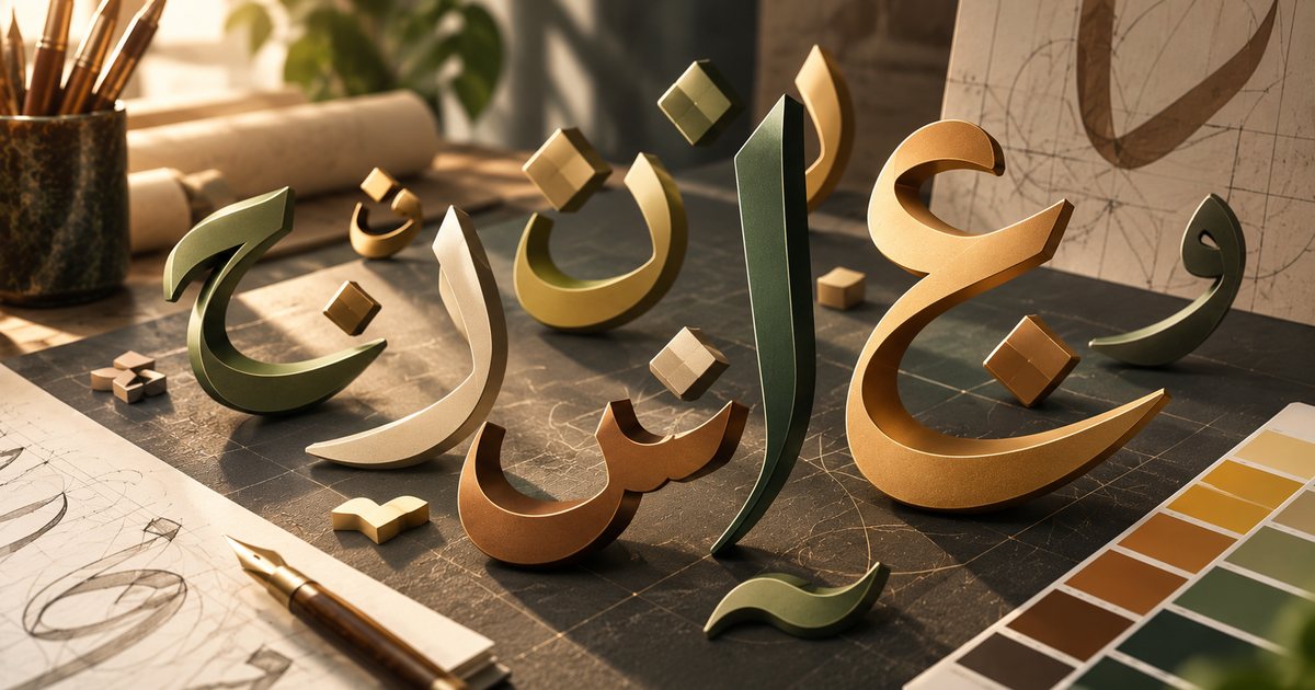
Typography is the craft of arranging letters so they are both readable and expressive. Arabic typography brings challenges that designers working only in Latin never meet: connected letters that change shape depending on their position in a word, dots and vowel marks above and below the letters, and a right-to-left direction that is constantly interrupted by Latin words and numbers. This guide covers the main Arabic script styles and where each fits, legibility at small sizes, kashida and diacritics, pairing Arabic and Latin typefaces, right-to-left pitfalls, and the basics of font licensing.
Key terms before you start
- Calligraphy and typefaces: calligraphy is written by hand and every piece is unique; a typeface is a digital system of letters that can be reused endlessly. Many digital Arabic typefaces are inspired by calligraphic styles but simplified to work on screen and in print.
- Family and weight: a family is a set of fonts sharing one design, such as light, regular and bold, and each of those is a weight.
- Letter forms: an Arabic letter has up to four forms: isolated, initial, medial and final. Six letters never connect to the letter after them: alif, dāl, dhāl, rāʾ, zāy and wāw. The software's text engine picks the right form automatically; if it does not support Arabic, the letters appear disconnected.
- Letter body: the Arabic counterpart of the Latin x-height. It sets the apparent size of the text and varies a lot from one Arabic typeface to another.
Arabic script styles and where each fits
| Style | Key traits | Good for | Avoid for |
|---|---|---|---|
| Naskh | Balanced and clear; the basis of most text typefaces | Long text, books, websites, apps | Rarely the wrong choice for text |
| Kufi | Geometric, angular, straight strokes | Headlines, logos, modern interfaces | Long text in its decorative forms |
| Thuluth | Grand curves and stacking that invite ornament | Ceremonial headings, heritage-style logos | Small sizes and running text |
| Diwani | Flowing, with interlocking letters | Invitations, certificates, greetings | Anything that must be read quickly |
| Ruqʿah | Simple, quick, compact letters | Informal headlines, a personal touch | Long formal documents |
| Maghribi | Wide, rounded curves | Work with a North African or cultural flavor | Audiences not used to reading it |
Naskh is the foundation of most Arabic text typefaces, which is why readers find it familiar and effortless. If you have more than a few lines of text, a Naskh-based typeface or a simplified modern design is the safe choice.
Kufi is one of the oldest Arabic styles, and its geometric nature has inspired many simplified modern typefaces that feel close to Latin sans-serifs. These simplified versions work well in interfaces and headlines; square and ornamental Kufi belongs in logos and graphic elements.
Thuluth and Diwani are styles for occasions and prestige. Their beauty lies in stacking and flow, which is exactly what makes them slow to read. Use them for a word or a short phrase, never for a paragraph.
Ruqʿah is the everyday handwriting of many Arabic writers. It feels personal and direct, which suits informal headlines and campaigns with a popular, street-level tone.
Maghribi is common across North Africa and has features that can confuse readers who are not used to it; for example, fāʾ takes a dot below and qāf a single dot above. If your audience is in the Gulf or Egypt, test its readability before committing to it.
Legibility at small sizes
Arabic text often looks smaller than Latin at the same nominal size, because the letter body is small relative to the ascenders and descenders. Practical rules:
- Size up slightly. If your Latin body text is 16 px, Arabic may need 17 or 18 px to look equivalent. Judge the apparent size by eye, not the number.
- Open up the line height. Dots, vowel marks, ascenders and descenders need more room than Latin does; values between 1.6 and 1.8 times the font size are a common starting point for long text.
- Avoid very thin weights at small sizes. Dots fade and counters close up, especially on weak screens or absorbent paper.
- Choose a typeface that separates similar letters such as initial bāʾ, tāʾ, nūn and yāʾ, ʿayn and ghayn, fāʾ and qāf, with clear dots that do not merge.
- Do not use fake italics. Arabic has no italic in the Latin sense, and slanting letters automatically distorts them. For emphasis, use bold or color.
- Do not add tracking. Letter-spacing on connected Arabic text breaks the joins or stretches them unnaturally, depending on the software.
- Be careful with underlines. They collide with dots and descenders; use color or weight to highlight links and key words.
- Stick to one numeral system. Choose Western digits or Eastern Arabic digits and use them consistently throughout, especially for prices and phone numbers.
Kashida: when and how to stretch
Kashida, or tatweel, is the elongation of the connection between two joined letters. It serves two purposes: fitting lines in justified text, and creating visual balance in headings and logos. In calligraphy it follows rules: it sits only between two connected letters, never at the end of a word, usually no more than once per word, and never exaggerated.
The most common digital mistake is typing the tatweel character (Unicode U+0640) by hand into live text to stretch words. It may look fine, but it breaks in-text search, corrupts copy and paste, confuses screen readers and spell checkers, and can render badly if the font changes. The alternatives: use kashida-aware justification in layout software where it is available, justify by widening word spacing, or simply align right, which is usually the safer option for narrow columns and websites. Manual stretching remains acceptable in headings and logos that have been converted to outlines, where nobody will search or copy the text.
Diacritics: when you need them
Most contemporary Arabic is written without full vowel marks, because readers infer them from context. They are essential in some places:
- Quranic verses, which must be fully and accurately vocalized.
- Poetry, educational content for children, and materials for people learning Arabic.
- Names and words that could be read more than one way, including unfamiliar brand names.
Not every typeface supports vowel marks or positions them correctly, especially decorative display fonts, so test with fully vocalized text before committing, and increase the line height when marks are dense.
Pairing Arabic and Latin typefaces
In bilingual material, two mismatched typefaces look like the work of two different brands. The criteria for a good pairing:
- Character: a Naskh-based Arabic usually sits well with a serif or humanist Latin, while a geometric Kufi-based Arabic suits a geometric sans-serif.
- Visual weight: match the apparent stroke thickness, not the weight name; one family's bold can equal another's medium.
- Apparent size: scale the Arabic up or the Latin down until the Arabic letter body balances the Latin x-height.
- Stroke contrast: a monolinear design pairs with a monolinear one, and a high-contrast design with a high-contrast one.
- Baseline and spacing: in mixed lines, check that baselines align, and set line height for whichever script rises and falls further.
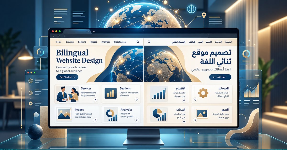
The easiest route is a family designed for both scripts together, such as IBM Plex Sans Arabic with IBM Plex Sans, or the Noto Arabic families with their Latin counterparts. Many Arabic typefaces include Latin characters, but their quality varies, so test them before relying on them. Always test the pairing with real content, such as a menu with dish names in both languages. For websites, see building a bilingual Arabic-English website.
Right-to-left pitfalls
- Disconnected or reversed letters. The software or its settings do not support Arabic shaping. Enable Middle Eastern language support in the application's settings (in Adobe apps, for example, this is tied to the World-Ready text engine), and never try to fix it by typing the letters backwards.
- Mixed-direction text. English words, numbers, phone numbers and percentages can push punctuation to the wrong end of the line and flip parentheses. Set the paragraph direction to right-to-left and check every mixed line by eye.
- Latin punctuation. Use the Arabic comma, semicolon and question mark in Arabic text, not their Latin equivalents.
- Mirroring the wrong things. In an Arabic layout the whole interface mirrors: order starts from the right and "next" arrows point left. But do not mirror logos, photos containing text, the play button in video players, or the order of digits within a number.
- Latin placeholder text. It hides the real length and direction of Arabic copy until the last minute, so use real Arabic text from the first draft.
How direction affects the reading order of a whole layout is explained in visual hierarchy and composition.
Font licensing
A font is software, and its license defines where you may use it: in print and images, embedded in a website, inside an app, in video, or in a logo. "Free" may mean free for personal use only. Open licenses such as the SIL Open Font License generally allow commercial use and embedding under conditions, the best known being that the font itself may not be sold on its own.
Keep the license file or invoice with every project, and do not hand purchased font files to a client unless the license allows it; the client usually needs a license of their own. Avoid downloading fonts from unknown sites, where many files are pirated or renamed copies. Because logos are so often built on lettering, also read logo design principles.
Practical checklist
- Is the body typeface clear, and based on Naskh or a simplified modern design?
- Are decorative styles limited to short headings?
- Have size and line height been tested at real size, on the device or on paper?
- Have you avoided fake italics, tracking and manual tatweel in live text?
- Are diacritics present where needed and correctly placed?
- Do the Arabic and Latin typefaces match in character, weight and apparent size?
- Have direction, punctuation and numbers been checked in every mixed line?
- Does the license cover every expected use?
For the wider fundamentals, go back to the complete beginner's guide to graphic design.