Graphic Design: The Complete Beginner's Guide
What graphic design is, the fields it covers, the six principles behind every good layout, the tools you actually need, and how a project moves from brief to final files.

Graphic design is visual problem-solving: arranging type, images, color and shape so that a specific message reaches a specific audience, who understand it quickly enough to act on it. A design is judged less by how attractive it is than by whether it does its job: the offer gets read, the brand name gets remembered, the button gets tapped. This is graphic design for beginners from the ground up: the fields you can work in, the principles behind every layout, the tools, the workflow from brief to delivery, and how to build a portfolio and a learning plan, with links to a deeper guide for each topic.
What graphic design is, and what it is not
An artist expresses a personal vision, and the audience judges it on its own terms. A designer serves an external goal and a defined audience, and the work is judged by one question: did it work? Picture a roadside banner for a restaurant's Ramadan iftar offer. If a driver cannot read the price and location in a couple of seconds, the banner has failed, however beautiful its illustrated lanterns are.
Design is also not the same thing as software skills. Knowing Photoshop is like knowing a word processor: necessary, but it does not make you a writer. The skills that matter are organizing information by importance, handling type, using color with intent, and understanding the client's business and audience. Designers rarely work alone. They sit between marketers, copywriters, developers and printers, and they need to speak each group's language.
The main fields of graphic design
The fields share the same principles but differ in their technical demands. Most designers start in one or two and branch out over time.
Visual identity and branding
Logos, color systems, typefaces, imagery style and supporting graphics, plus the rules for applying them everywhere the brand appears. It demands strategic thinking before any drawing. See what a visual identity includes and how to build one, logo design principles and common mistakes, and brand guidelines that keep a brand consistent.
Advertising and social media design
In Gulf and Egyptian markets this is where most day-to-day volume sits: feed posts, stories, paid ad creatives, and seasonal campaigns for Ramadan, Eid and sales events. It rewards speed, well-built templates and knowing each platform's formats, all covered in designing social media posts.
Print design
Brochures, menus, company profiles, roll-up banners and business cards. Print is unforgiving: CMYK color, 300 PPI images and bleed are not optional. The details are in preparing print-ready files.
Packaging design
Boxes, labels and bags. You design in three dimensions, think about materials and folding, and leave room for information that regulators may require on certain products, which varies from country to country. See packaging design.
Digital interface design
Screens for websites and apps. It sits closer to product design, because users interact with the design rather than just look at it. Start with UI and UX fundamentals.
Neighboring fields
Illustration, infographics, signage and wayfinding for buildings and exhibitions, and motion graphics, which has its own section starting with the complete guide to animation and motion graphics.
The core principles behind every design
Six principles show up in almost every field. Learn them first, then use them as a diagnostic checklist whenever a layout feels wrong.
Contrast
Differences in size, weight, color or shape tell the eye what matters. If everything is big and bold, nothing stands out. Contrast is also about legibility: light text over a busy photo needs a dark semi-transparent overlay or a calmer area of the image.
Alignment
Every element should line up with something else along an invisible line. Arabic layouts read from the right, so right alignment is the natural choice for running text, while centering suits headlines and short lines. Mixing alignments without a reason is the fastest way to make a layout look careless.
Repetition
Reusing the same colors, typefaces, shapes and spacing creates consistency, and consistency is what lets people recognize a brand from a single post before they see the logo. In a carousel, repetition is what ties the slides together.
Proximity
Related items sit close together; unrelated items get space between them. Distance itself carries meaning: the product name belongs next to its price, and contact details belong in one block rather than scattered around the corners.
Balance
Every element has visual weight. Large, dark and saturated elements weigh more, and so do human faces. Symmetrical balance feels formal and stable, which suits invitations and certificates. Asymmetrical balance feels livelier and suits ads, as long as a heavy element on one side is offset by space or lighter elements on the other.
White space
Empty space is not wasted space. It gives elements room to breathe, directs the eye, and often reads as quality and confidence. "Can you fill that gap?" is one of the most common client requests, and part of the job is explaining calmly that every addition weakens what is around it.
Together these principles produce visual hierarchy, the order in which the eye reads a design, covered in visual hierarchy and composition. Color and type each deserve their own study: see color theory and color psychology and typography and Arabic fonts.
Tools: what you actually need
First understand the two kinds of image. Vector graphics are built from mathematical paths, so they scale to billboard size without losing sharpness; logos and icons belong here. Raster images are grids of pixels, so their quality depends on resolution and they break up when enlarged too far. Photos are raster by nature.
| Kind of work | Software category | Neutral examples |
|---|---|---|
| Logos, icons, illustration | Vector editors | Illustrator, Inkscape |
| Photo editing and compositing | Raster editors | Photoshop, GIMP |
| Multi-page print documents | Layout software | InDesign |
| Website and app screens | Interface design tools | Figma |
| Everyday content from templates | Browser-based template tools | Canva |
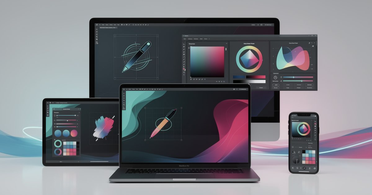
You do not need all of them on day one. Get genuinely good at one tool in each category you actually use; the principles transfer between programs. Beyond software you need a computer that can handle large files, a screen with reasonably accurate color, and fonts licensed for commercial use. The trade-offs are laid out in design software compared.
The workflow: from brief to delivery
Projects that go wrong usually go wrong at the start, not inside the software. This sequence protects the designer's time and the client's money:
- Brief. A short document stating the goal, audience, key message, formats, deadlines, budget and who approves. If the client does not have one, write it with them using how to write a design brief.
- Research. Understand the business, its competitors and its audience, and collect references in a moodboard that the client sees before any design starts, so expectations line up early.
- Sketching. Quick thumbnails on paper for several directions. Paper is faster than any program and stops you falling in love with the first idea.
- Digital drafts. Develop two or three directions with real content. Never use Latin placeholder text where Arabic will go; the real length and direction of Arabic copy change the whole layout.
- Presentation and feedback. Show the work in context, such as a post inside a phone frame or a logo on a shopfront, and explain the reasoning behind each decision. Ask for consolidated feedback from one person with the authority to decide.
- Refinement. A number of revision rounds agreed in advance, with every change logged.
- Delivery. Final files in the right sizes and color mode for each use, after a last proofread of all text and numbers.
Delivering files professionally
Name files so they explain themselves, for example "client_ramadan-offer_1080x1350_v3", and keep print and screen files in separate folders. Include a list of the fonts used and their licenses, and agree at the start whether source files are part of the deliverable. Ownership of source files is one of the most common causes of designer-client disputes.
Common beginner mistakes
- Using more than two type families in one piece, so it loses any clear personality.
- Filling every empty area, until the most important element gets lost.
- Placing text over a busy photo with no treatment for contrast.
- Designing on a large monitor without checking the real output size, on a phone or on paper.
- Stretching a logo or photo out of proportion.
- Using images pulled from search results without a license, a real legal risk explained in image rights and licensing.
- Arabic letters appearing disconnected or reversed because the software or its settings do not support Arabic, and shipping the file without noticing.
- Starting to design before a brief has been agreed.
Building a portfolio that wins work
Your portfolio is your main sales tool, and clients or employers usually give it a few minutes at most. It should answer one question: can this person solve my problem?
- Quality over quantity. Six to ten strong projects persuade more than thirty average ones. Cut anything you are not proud of.
- Present projects as case studies. The problem, the audience, early sketches, the directions you rejected and why, then the final design and its applications.
- Label honestly. Self-initiated projects are fine and useful, but mark them as concept work. Never present a redesign of a well-known brand as if it were commissioned.
- Ask before publishing. Some clients do not allow their work to be shown, so agree on this up front.
- Show Arabic and bilingual work. Setting Arabic type well alongside English is a real advantage in Gulf and Egyptian markets.
- Aim it at the work you want. If you want identity projects, lead with them instead of burying them under dozens of social posts.
Keep one version on a personal site or portfolio platform, and a lightweight PDF that is easy to send by email or WhatsApp.
A realistic learning path
There is no shortcut, but doing things in the right order saves years of wandering:
- Principles before software. Learn the six principles plus the basics of type, color and hierarchy. Analyze the design around you every day, from supermarket packaging to street signs and the ads on your phone, and ask why one works and another does not.
- One tool per category you need. Start with a vector editor and a raster editor, and do short exercises that each target a single skill.
- Complete projects from realistic briefs. Write yourself a brief for an imaginary local business, such as a café in Kuwait or a bakery in Cairo, then design its logo, identity, menu and launch posts. A full project teaches what isolated exercises cannot.
- Critique and specialization. Show your work to more experienced designers and ask for honest critique, then pick a field to go deep in and take on small real jobs.
Recreating a well-made design exactly is another useful way to understand its decisions, as long as it stays private practice and is never published as original work.
Pre-delivery checklist
- Is the main message clear within a few seconds?
- Is there one obvious focal point?
- Are elements aligned and is spacing consistent?
- Two type families at most, at sizes readable where the design will actually be seen?
- Enough contrast between text and background?
- Arabic text proofread, letters connected, direction correct?
- Prices, numbers and dates confirmed with the client?
- Correct size and color mode for screen or print?
- Every image and font licensed for commercial use?
- Written approval of the final version?
If every answer is yes, the design is ready to ship. If you stall on one of them, go to the guide in this section that covers it.