UI and UX Design Fundamentals
The difference between UI and UX, and the working stages from user research to a design system, with accessibility basics and the rules of right-to-left interfaces.
UI/UX design covers two overlapping disciplines. User experience (UX) is about whether people can get done what they came to do, easily. User interface (UI) is about the visible, interactive layer they touch: buttons, type, color and the states of each element. A beautiful interface on top of a confusing flow fails, and a logical flow with a poor interface loses trust. This guide covers the core stages from user research to a design system, plus accessibility basics and what changes in Arabic interfaces.
UI vs UX
| User experience (UX) | User interface (UI) | |
|---|---|---|
| Core question | Can users reach their goal easily? | Is the screen clear, consistent and comfortable to use? |
| Outputs | Research findings, user journeys, information architecture, wireframes, test results | Final designs, components, interaction states, design system |
| Signs of success | Tasks completed, fewer errors, shorter paths | Clarity, consistency, readability, enough contrast |
In small teams the same person often does both. What matters is the order: understand before you decorate. The visual principles behind an interface, such as hierarchy, color and type, are the principles of graphic design applied to an interactive screen. If the designer's role and the developer's role blur for you, see web design vs. web development.
The stages at a glance
- Research: understand the users and the problem.
- Information architecture: organize and name the content.
- Wireframes: lay out each screen without visual detail.
- Prototype: link screens to simulate real use.
- Testing: watch real users attempt specific tasks.
- Final design and design system.
- Handoff to developers, then measurement and improvement.
This is a loop, not a straight line. A test result can send you back to the information architecture, and measurement after launch starts the next cycle.
User research
The goal is to learn what users are trying to achieve, the words they use and what gets in their way. Practical methods:
- Short interviews with a small number of real or likely users.
- Analytics data: where do visitors leave, and where do they search at length without finding anything?
- Customer service questions: repeated questions by phone and WhatsApp reveal information missing from the interface.
- Competitors' apps and their reviews in app stores, which contain user complaints in the users' own words.
- Direct observation of people using the current product.
Ask about past behavior, not predictions. "Would you use this feature?" gets you politeness. "The last time you booked an appointment, how did you do it?" gets you facts.
Illustrative example: a clinic booking app in Cairo. Interviews reveal that many users book for a parent or a child rather than for themselves, so "book for someone else" becomes a core flow instead of a hidden option. Research usually produces a ranked list of key tasks, user personas and a user journey map.
Information architecture
Information architecture is organizing and naming content so people can find what they need. The steps:
- Content inventory: everything the product will contain, pages and functions alike.
- Grouping: putting related items together.
- Naming in the users' language: people look for "Offers", not "Promotional campaigns".
- A sitemap or app map, then the navigation.
A useful tool is card sorting: write content titles on cards and ask users to group and name them. You learn how they think, not how your team thinks. In bilingual products, labels are not literal translations; choose and test them in each language. Avoid vague catch-all labels like "Other services", a sign that grouping is unfinished.
Wireframes
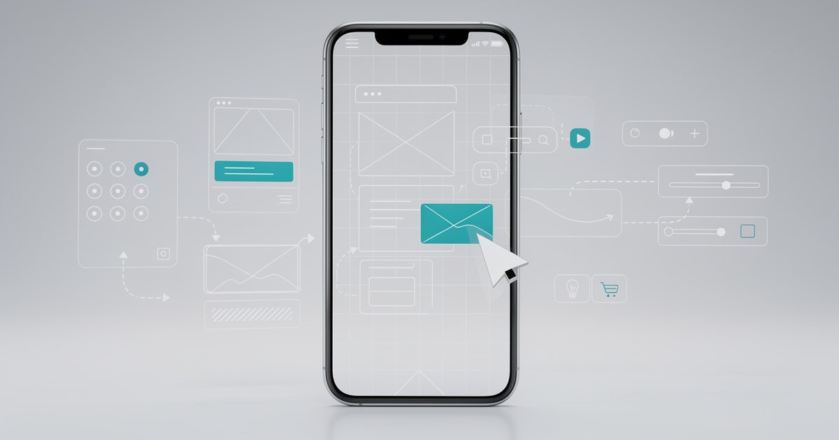
A wireframe is a simplified grayscale layout of a screen showing what appears and in what priority, without colors or final images, so discussion stays on structure rather than taste.
- Start with the phone screen, since many users arrive on mobile first, then expand to larger screens as in responsive web design.
- Use real or realistic content instead of placeholder text, especially in Arabic, because text length changes the layout.
- Add notes on behavior: what happens on tap, and what shows when a list is empty?
Prototypes
A prototype links screens together to simulate real use, built in tools such as Figma. It can be low fidelity (linked wireframes) or high fidelity, close to the final look. Its value is that you can test an idea before writing a line of code, and changes are far cheaper at this stage than after development.
Do not over-polish a prototype before testing it, and build only the flows you plan to test. Motion between screens helps users understand how screens relate; see motion design in websites and apps.
Usability testing
- Define three to five realistic tasks, such as "Order two bags of coffee and pay cash on delivery."
- Recruit participants who resemble your real users, not your teammates.
- Ask them to think aloud as they work, and do not help or steer them.
- Note where they hesitate or make mistakes, and rate each problem: blocks the task, causes friction, or cosmetic.
- Fix the most serious issues first, then test again.
Small, repeated rounds are more useful than one large test at the end of a project. Testing can be remote or in person, with screen recording only after the participant agrees. Avoid asking "Did you like the design?" The point is to observe behavior, not collect opinions.
Design systems
A design system is a set of reusable decisions:
- Design tokens: colors, type scale, spacing, corner radii and shadows.
- Components: buttons, input fields, cards, lists and dialogs.
- States for each component: default, hover, pressed, focus, disabled, error and loading.
- Patterns: forms, empty states and error messages.
- Documentation: when to use each component and when not to.
A design system creates consistency and speeds up both design and development, and it connects directly to your brand guidelines, which define the colors and fonts. Start small: gather existing components, merge the near-duplicates, document them gradually, and design every component for both text directions from the start.
Accessibility basics
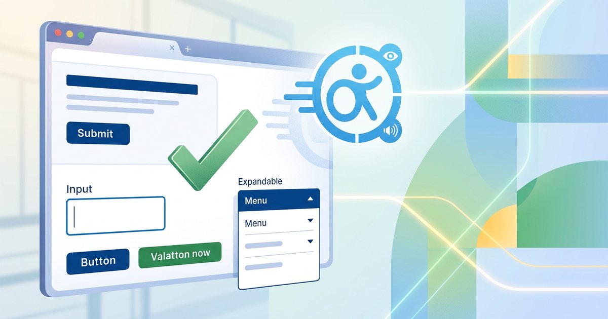
- Contrast: WCAG level AA requires a contrast ratio of at least 4.5:1 for normal text and 3:1 for large text.
- Touch targets: platform guidelines recommend targets of at least about 44 points per side on iOS and 48 units on Android.
- Do not rely on color alone: an error state needs an icon and a message alongside the red.
- Visible field labels: placeholder text disappears as people type and does not replace a label.
- Visible focus for keyboard users, and a logical navigation order.
- Text that can be enlarged without breaking the layout, and alternative text for meaningful images.
These basics help everyone, not only people with disabilities. The technical details are in web accessibility.
Right-to-left interfaces
An Arabic interface is not an automatically mirrored copy of the English one:
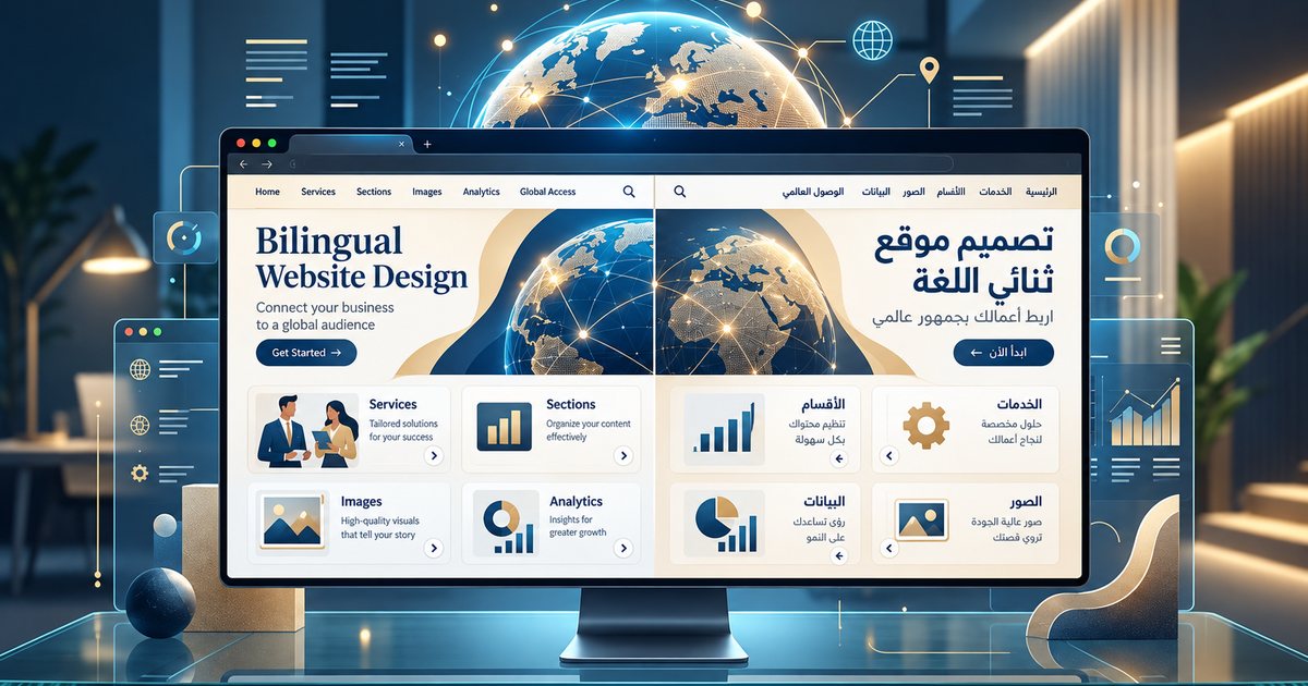
- Mirror: the overall layout and navigation, back and forward arrows, progress bars and steppers, sliders and breadcrumbs.
- Do not mirror: the brand logo, media playback controls and numbers. Phone numbers, card numbers and codes still run left to right.
- Bidirectional text: English brand or model names inside an Arabic sentence can misplace punctuation, so test with real content.
- Type: Arabic needs more line height, and italics are not part of the Arabic writing tradition, so artificially slanted Arabic looks distorted. See Arabic fonts in design.
- Input fields: email addresses, URLs and phone numbers are entered left to right, even in an Arabic interface.
Design with Arabic content from the start, test with Arabic-speaking users, and do not settle for flipping the English design at the end. For building the site itself in two languages, see building a bilingual Arabic–English website.
Common mistakes
- Starting with colors and shapes before understanding user tasks.
- Designing for yourself, or testing only with colleagues.
- Forgetting empty, error and loading states.
- Similar components looking different on every screen.
- Flipping an English design into Arabic without reviewing content and direction.
Next steps
- Pick a small, real product, such as a booking page for a local salon or restaurant.
- Interview three to five people from its audience about their last booking experience.
- Write down and rank the key tasks, then sketch the information architecture.
- Draw phone wireframes first, then link them into a prototype.
- Test the prototype with at least three users and fix the two most serious problems.
- Turn the final design into documented components, and check contrast, touch targets and Arabic direction.
For choosing a tool for this work, see design software compared.