Web Accessibility: How to Build a Website Everyone Can Use
A practical guide to making your site usable by everyone, including people with disabilities: WCAG principles, common mistakes and a testing routine that covers Arabic.
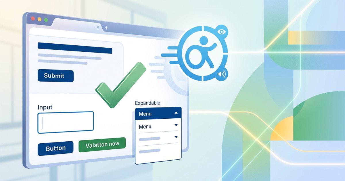
Web accessibility means that everyone can perceive, navigate and use your website, including people with visual, hearing, motor and cognitive disabilities, and people in temporary situations such as a broken arm or a phone screen in bright sunshine. An accessible site is easier for everyone, clearer to search engines, and less likely to be excluded from tenders and organizations that require it. Most of the work is sound design and coding practice, not a separate budget.
What WCAG is
The Web Content Accessibility Guidelines (WCAG) are an international standard published by the W3C and the reference most policies and contracts build on. Its success criteria come in three levels: A, the minimum; AA, the usual target in policies and contracts; and AAA, the highest, which is rarely required for a whole site. Some government bodies and sectors require a specific level and version, so check the requirements in your country and industry.
The four principles
| Principle | What it means | Examples |
|---|---|---|
| Perceivable | Content can be received through at least one sense | Alt text for images, captions for video, sufficient contrast, not relying on color alone |
| Operable | Every function can be used in more than one way | Keyboard navigation, enough time, no dangerous flashing, adequate target sizes |
| Understandable | Content and behavior are clear and predictable | Page language declared, consistent navigation, clear error messages |
| Robust | Works with browsers and assistive technologies | Sound semantic HTML, correct use of ARIA attributes |
Alt text for images
Alt text is what a screen reader reads in place of an image, and what appears if the image fails to load. The rule: describe the image's purpose and meaning in context, not just its appearance.
| Image | Weak alt text | Good alt text |
|---|---|---|
| Product photo | Image | Brown leather bag with an adjustable shoulder strap |
| Shopping cart icon used as a link | Icon | Shopping cart |
| Decorative background pattern | Decorative background | Empty alt text so screen readers skip it |
| Sales chart | Chart | A summary of what the chart shows, with the data table nearby |
- Decorative images get an empty alt attribute (alt=""), not a missing one.
- An icon that works as a link or button is described by its function: "Search", not "magnifying glass".
- An image containing text carries that text in its alt.
- Don't start with "image of"; the screen reader already announces that it is an image.
- Write alt text in the page's language and keep it short.
Good alt text also helps image search, which makes it part of technical SEO basics.
Contrast and color
Level AA requires a contrast ratio of at least 4.5:1 between normal text and its background, 3:1 for large text (18 point, or 14 point bold, roughly 24 px and 18.66 px), and 3:1 for important interface components and graphics, such as input borders and icons. Thin Arabic typefaces at small sizes are harder to read, so give them a larger size or heavier weight.
- Don't rely on color alone. An invalid field needs a message and an icon, not just a red border, and links inside paragraphs need an underline or another cue besides color.
- Text over images needs an overlay or a background that guarantees contrast.
- Placeholder text inside fields is usually faint, so never put essential information there.
- Browser developer tools show contrast ratios directly. For the aesthetic side of color choices, see color theory and color psychology.
Keyboard navigation and focus
Many people don't use a mouse: people with motor disabilities, screen reader users and people who simply prefer the keyboard. Test your site with Tab and Shift+Tab to move, Enter and Space to activate, arrow keys inside menus and Esc to close.
- Visible focus indicator: never remove the default focus outline without a clear replacement.
- Logical order: focus follows the visual reading order, which runs right to left on Arabic pages. Avoid positive tabindex values.
- Skip link: a "Skip to content" link at the top saves users from tabbing through the whole menu on every page.
- Dialogs: focus moves into a dialog when it opens, stays inside it, Esc closes it, and focus returns to the button that opened it.
- Native elements first: use a button element for actions and an a element for navigation. A div with a click handler is not reachable by keyboard by default.
- Automatic movement: carousels that move on their own for more than five seconds need a pause control, and nothing should flash more than three times per second.
- Target size: make tap targets big enough. WCAG 2.2 at level AA sets a minimum of 24 by 24 CSS pixels, with specific exceptions.
a:focus-visible,
button:focus-visible {
  outline: 3px solid #1a5fb4;
  outline-offset: 2px;
}
Forms and labels
- Every field has a visible label that is programmatically associated with it. Placeholder text is no substitute, because it disappears as soon as the user types.
- Group related options, such as radio buttons, with a fieldset and legend.
- Mark required fields in text, not only with a colored asterisk.
- Make error messages specific and place them next to the field, such as "Enter your mobile number with the country code" rather than "Invalid input". Link them to the field in code, and never wipe what the user already typed.
- Use the autocomplete attribute for name, email and phone. It helps everyone, especially people with motor and cognitive disabilities.
- If you use a check to confirm the user is human, provide an alternative that doesn't depend on sight alone.
<label for="phone">Mobile number</label>
<input id="phone" type="tel" autocomplete="tel" aria-describedby="phone-error">
<p id="phone-error">Enter your mobile number with the country code.</p>
Video and audio
- Synchronized captions for every video with speech, including sounds that matter for understanding, such as a knock at the door or a ringing phone.
- A full transcript for audio content such as podcasts.
- Audio description or a text alternative for important visual information that the dialogue doesn't mention.
- No autoplaying sound, and player controls that work with the keyboard.
- Closed captions that can be switched on are usually better than captions burned into the picture, because in many players users can show, hide and enlarge them.
Setting up and styling captions is covered in subtitles and on-screen text.
Testing: automated tools and screen readers
- Automated checks: tools such as Lighthouse (built into Chrome), axe and WAVE catch obvious problems like missing alt text and low contrast, but they cover only part of the criteria and cannot judge, for example, whether alt text is any good.
- Keyboard test: put the mouse aside and complete the key tasks: navigation, search, the contact form and checkout.
- Zoom: zoom to 200% and then 400%, and confirm content reflows without horizontal scrolling.
- Screen readers: NVDA (free) and JAWS on Windows, VoiceOver built into Apple devices and TalkBack built into Android. Try navigating by headings, landmarks and the links list, and listen to what is announced as you fill in forms.
- Real users: nothing replaces watching someone who uses assistive technology every day try your site.
Arabic-specific considerations
- Set lang="ar" correctly so the screen reader uses an Arabic voice, and mark English words inside Arabic text with lang="en", as explained in building a bilingual Arabic–English website.
- Make sure an Arabic voice is available on the operating system and screen reader you test with; the availability and quality of voices differ between platforms.
- Arabic voices infer the short vowels from context, so they can mispronounce ambiguous words. Adding vowel marks to an ambiguous word in a critical spot may help, but there is no need to vowel whole texts.
- Avoid the tatweel (elongation) character for decorative stretching, because it can confuse speech output and search.
- Don't present headings or important text as images of decorative Arabic calligraphy without real text alongside.
- In right-to-left layouts, the source order must match the visual order; otherwise the screen reader and keyboard focus move through the content in a different order from what users see.
Practical checklist
- Every meaningful image has alt text describing its purpose, and decorative images have empty alt text.
- Contrast reaches 4.5:1 for normal text and 3:1 for large text and interface components.
- Everything works with the keyboard, focus is visible, and a skip link bypasses the menu.
- Every field has a visible label, and error messages are specific, written out and next to the field.
- Videos have captions and audio content has transcripts.
- Headings follow a logical order without skipping levels, and the page language is declared.
- Nothing moves automatically without a pause control.
- The site has been tested with an automated tool, then the keyboard, then a screen reader in both languages.
Accessibility is part of project quality from the design stage, not a layer added at the end. See where it fits in building your business website, and its foundations in UI and UX design fundamentals.