Packaging Design: When the Box Becomes the Ad
Packaging protects the product, informs the buyer and sells in a moment. The steps of packaging design, from dielines and label information to bilingual packs and e-commerce unboxing.
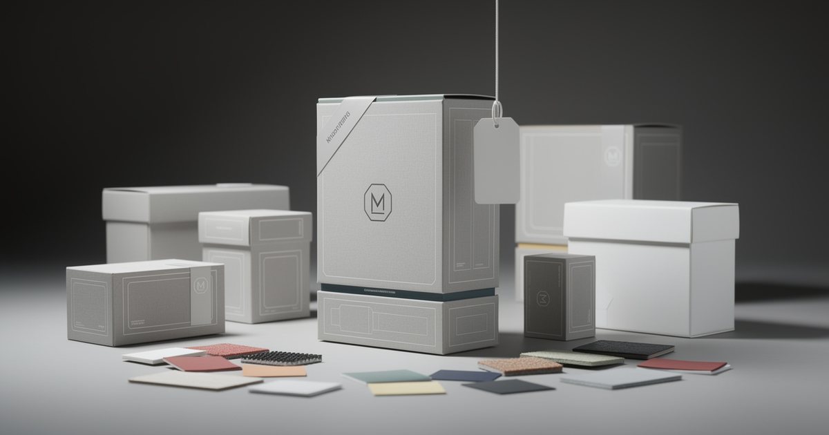
Packaging design is not decoration on a box. A pack does three jobs at once: it protects the product, tells buyers what they need to know, and sells at the moment someone stands at the shelf or opens a parcel at home. So the work starts with structure, dimensions and mandatory information, and graphics and color come after. This guide takes you from the dieline to the e-commerce unboxing, including the mistakes that raise costs or delay a launch.
What packaging does, layer by layer
A single product usually has three layers of packaging, each with its own priorities:
- Primary packaging touches the product directly: a jar, bottle or pouch.
- Secondary packaging is the carton that holds the primary pack. It usually carries most of the branding and information.
- Shipping packaging is the corrugated box that moves the product to a warehouse or a customer.
Illustrative example: a local sidr honey sold in a glass jar with a label, inside a gift box for seasonal sales, with online orders shipped in a padded carton.
Before opening any design software, answer these questions. How big, heavy and fragile is the product? Where is it sold: supermarket, pharmacy, online store, gift shop? What are the storage and transport conditions? Gulf summer heat, humidity and condensation in chillers all affect inks and adhesives. What quantity is needed? That decides the printing method and the unit cost. Capture the answers in a clear design brief before drawing anything.
Structure and dielines
Common structural formats include folding cartons, rigid boxes for premium gifts such as perfume, dates and Eid sweets, labels on jars and bottles, stand-up pouches for coffee, spices and snacks, and paper sleeves that slide over another box.
A dieline is a flat template showing cut lines, fold lines, glue flaps, the bleed area and the dimensions of each panel. It usually comes from the printer or box maker because it is tied to their machinery, and the artwork must match it exactly.
- Put the dieline on its own layer in a named spot color, set so it does not print.
- By common convention cut lines are solid and folds are dashed, but confirm your manufacturer's conventions.
- Never resize a dieline yourself. Board thickness changes dimensions at the folds, and the manufacturer accounts for it.
- On round bottles buyers only see part of the label at a time, and tapered containers need a special curved label template.
The step many people skip is the paper mock-up. Print the design at full size, cut it, fold it and glue it. You will immediately spot text upside down on a top flap, a barcode sitting on a fold, or a logo hidden under the glue flap. Color, resolution and bleed follow the same rules as in preparing print files, except that box makers sometimes ask for a larger bleed.
Shelf impact
Shoppers see your product among dozens of competitors and decide in moments. Test the design in conditions close to reality:
- Distance test: place the mock-up two or three meters away. Can you identify the brand, the product and the variant?
- Neighbor test: put the printed mock-up next to competing products on a real shelf, or in a photo of one. Does it stand out or disappear?
- Color blocking: when several packs sit side by side, a repeated design forms a block of color visible from a distance, an advantage for brands with a distinctive color.
- Category codes: every product category has visual conventions shoppers rely on, such as colors linked to flavors. Decide deliberately whether to follow or break them. Breaking them gets attention but can confuse.
E-commerce has its own shelf: a small thumbnail in a product grid. The product name and variant must read at that size, and the pack should have a clear silhouette. Photographing the pack well is part of shelf impact too, as covered in product photography on a budget.
Information hierarchy on the pack
The front panel answers the shopper's questions in order: which brand, what product, which variant, flavor or size, why choose it, and how much is inside. One key benefit on the front beats ten competing ones. Side and back panels carry the details: ingredients, directions, storage, contact information and the barcode.
For a product range, build a variant system: a fixed layout across all packs, with a color or icon identifying each variant. Launching a new flavor then becomes a small update rather than a new design, and shoppers find what they want faster. All of this applies the rules of visual hierarchy and composition, part of the fundamentals in Graphic Design: The Complete Beginner's Guide.
Mandatory label information
Requirements vary by country and product category, such as food, cosmetics or supplements. Details commonly required include:
- Product name and description.
- Ingredient list for food and cosmetics, with allergens highlighted.
- Net weight or volume.
- Production and expiry dates, and a batch number.
- Name and address of the manufacturer or importer, and country of origin.
- Storage conditions, directions for use and warnings.
- A halal mark where claimed, issued by a recognized certification body.
Many markets in the region require the core information in Arabic, or in Arabic alongside another language.
Design points linked to this information:
- Leave a blank area for the date and batch number printed on the production line, and agree its position and size with the factory.
- Retail barcodes need a registered number from GS1. Keep the quiet zone around the barcode clear, do not shrink it below the recommended size, and use dark bars on a light background. Red bars scan poorly because many scanners use red light. Avoid folds and tight curves, and test scanning before the full print run.
- Minimum text sizes for some mandatory information may be set by regulation, so check them.
Bilingual Arabic and English labels
Common ways to organize a bilingual pack:
- Separate panels: the product name in both languages on the front, then one side panel in Arabic and one in English.
- Parallel columns: Arabic in the right-hand column and English in the left on the back panel.
- Stacked blocks: a full Arabic block followed by an English block, for narrow packs.
Some rules hold in every case. Never mix both directions in one line. Align Arabic to the right and English to the left, and plan for the two texts running to different lengths. Pair an Arabic and a Latin typeface with similar weight and visual size, so neither language looks secondary by accident; see Arabic fonts in design. Translation should not be literal, product names may be transliterated, and a native speaker should proofread each language. Finally, check that Arabic letters are still joined after the file has moved between programs. It is one of the most common faults in packaging files.
Sustainability
- Right-sizing: a box that fits the product means less filler and a smaller shipping volume.
- Fewer, simpler materials: a single-material pack, such as all paper rather than paper with a glued-on plastic window, is easier to recycle.
- Finishes only where they add value: lamination and heavy foil can complicate recycling.
- Reusable packs: tins or date boxes that customers keep put the brand in their home.
- Clear disposal instructions printed on the pack.
- No unproven environmental claims: phrases like "eco-friendly" need evidence, and some markets regulate such claims.
Unboxing for e-commerce
For an online store, the package is the customer's first physical contact with the brand, so it deserves its own plan:
- Protection first: the shipping box must survive courier handling and heat. The outside can be plain with the print inside; a plain exterior draws less attention to valuable parcels.
- Layers of opening: tissue paper, a branded seal sticker, and the product visible as soon as the box opens.
- An insert card: a short thank-you, usage or care instructions, a QR code to reorder over WhatsApp or leave a review, and return steps if needed. The return policy itself is covered in shipping, delivery and returns.
- Cash on delivery: customers may inspect the parcel in front of the courier before paying, so make the pack easy to open and presentable from the first second.
- Seasons: a Ramadan or Eid sleeve or sticker creates the sense of occasion without redesigning the whole box, and fits into seasonal campaign planning.
Practical checklist
- Have you defined each packaging layer, its job, and the storage and transport conditions?
- Did you get the dieline from the manufacturer and design on it without changing its dimensions?
- Did you build a full-size paper mock-up and check the orientation of every panel?
- Did you test the pack from a distance, next to competitors and as a thumbnail?
- Does the front panel answer brand, product, variant, benefit and quantity?
- Have you checked mandatory information with the authorities in each market, and left space for date and batch coding?
- Is the barcode the right size, in scannable colors, and tested before printing?
- Is the Arabic text properly joined, and has a native speaker proofread each language?
- Have you avoided unnecessary materials and finishes, and unproven environmental claims?
- Have you planned the unboxing for online orders, including the insert card?