Preparing Print Files: CMYK, Resolution and Bleed
White edges, dull colors and blurry photos are print mistakes you can prevent before sending the file. A step-by-step guide to print-ready files with a final checklist.
Print-ready files are what turn a design that looks good on screen into something a printer can reproduce the way you expect. Screens make color from light while presses build it from ink, paper is cut by a machine with a small margin of error, and a font that is not embedded may be swapped for another. Most costly print mistakes, such as white slivers at the edge, dull colors and blurry photos, can be prevented with a fixed set of steps before you send the file. This guide walks through them in the order you need them.
Why a print file is different from a screen file
Three physical facts govern print that do not exist on screen. Ink cannot reproduce every color that light can. Size is fixed, so an image cannot be enlarged after printing. Cutting is mechanical and can drift by a fraction of a millimetre. On top of that, the paper itself changes how colors look.
So the first rule is: get the printer's specifications before you start designing, not after you finish. Every printer sets its own bleed, color requirements, file format and minimum text size. If you are new to color, type and composition in general, start with Graphic Design: The Complete Beginner's Guide and come back to these steps.
Color: CMYK vs RGB
- RGB (red, green, blue) is additive: it builds color from light. It is the language of screens and cameras.
- CMYK (cyan, magenta, yellow, key/black) is subtractive: it builds color from inks that absorb light. It is the language of printing presses.
The CMYK gamut is narrower than RGB. Some vivid screen colors, such as acid green, electric blue and glowing orange, print calmer and less saturated. Rather than being surprised when the job arrives:
- Work in CMYK from the start for print pieces, or turn on soft proofing if you stay in RGB.
- Ask the printer which ICC color profile they use. It depends on the press and on coated versus uncoated paper.
- Take CMYK values for brand colors from your brand guidelines instead of relying on automatic conversion from screen values, which can give a slightly different result each time.
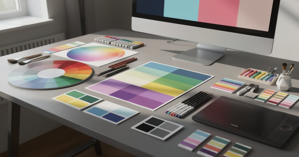
Spot colors, such as Pantone inks, are premixed inks used when a brand color must stay exactly consistent across thousands of copies, as on product packaging. They are used mainly in offset and screen printing and add cost; digital presses usually simulate them with CMYK. For choosing colors in the first place, see color theory and color psychology.
Resolution: 300 PPI at final size
Resolution is measured in pixels per inch (PPI), and it only means something relative to the size at which the image will print. The common rule for pieces viewed up close, such as business cards, flyers, brochures and packaging, is 300 PPI at final print size.
The calculation: divide the size in millimetres by 25.4 to get inches, then multiply by 300. An A4 page (210×297 mm) needs an image of roughly 2480×3508 pixels to fill it at 300 PPI.
Worked example: a 1080×1080 px image taken from a social post is enough, at 300 PPI, for a square about 9 cm wide. Put it on a poster and it will look blurry, however sharp it seemed on a phone.
- Increasing resolution in software does not add detail. Changing 72 to 300 with resampling fills pixels with guesses; without resampling it only shrinks the print size.
- Large formats viewed from a distance, such as roll-up banners and billboards, usually accept lower effective resolution. Ask the printer what works for each size, and see outdoor and print advertising for how these formats are used.
- Logos, text and icons should stay vector, not raster. Vector art stays sharp at any size.
- Layout tools such as InDesign show the effective PPI of each placed image after scaling. That is the figure that matters.
Bleed, safe margin and crop marks
The trim is the final size of the printed piece. Bleed is the extension of any background or image that touches the edge beyond the trim line, commonly 3 mm on each side. Cutting machines drift slightly; without bleed, a thin white line can appear along the edge.
Example: a 90×50 mm business card is built on a 96×56 mm canvas once 3 mm is added on every side.
- Safe margin: keep text, logos and contact details at least 3 to 5 mm inside the trim, and more in booklets near the spine.
- Crop marks are short lines outside the page that show the printer where to cut. Switch them on when exporting the PDF; never draw them inside the artwork.
- Avoid thin borders near the edge. Any slight shift in cutting makes the border wider on one side than the other. Make it wide enough to absorb the shift, or drop it.
- Some printers ask for a different bleed for packaging and large formats. Follow their specification.
Fonts: embed or outline
If the printer's system cannot find your font, it will substitute another. Layout shifts, and Arabic letters may break apart. There are two ways to prevent this:
- Embed fonts in the PDF. This is the default in print export presets. Check that the font license allows embedding.
- Convert text to outlines. This suits logos and final artwork, especially if the printer will open the file in different software. Keep an editable copy, because outlined text cannot be edited.
With Arabic text, check after conversion that letters are joined and dots and diacritics sit in the right place. Avoid very thin rules and very small text: many printers recommend lines no thinner than about 0.25 pt, and small Arabic text can lose its dots. If you hand over the open design file rather than a PDF, use the Package feature to collect fonts and linked images in one folder. For choosing Arabic typefaces, see Arabic fonts in design.
Rich black vs plain black
- Plain black is black ink only at 100% (K 100). Use it for text and fine details. It stays crisp and is unaffected by slight misregistration between ink plates.
- Rich black adds other inks under the black so large dark areas look deeper. A common recipe is C 60, M 40, Y 40, K 100, but ask your printer which one they prefer.
Every printer also has a maximum total ink coverage for any one spot. Going over it causes slow drying and ink transferring between sheets, so ask before building large dark backgrounds.
Exporting a print PDF
PDF/X is a family of international standards for exchanging print files reliably: fonts are embedded, color is defined, and features unsuitable for print are excluded. The two versions you will meet most often:
- PDF/X-1a accepts only CMYK and spot colors and flattens transparency.
- PDF/X-4 keeps live transparency and supports color management with ICC profiles.
Use whichever your printer asks for. Before exporting, check that bleed is included, crop marks are on, image compression is high quality, and pages are exported as single pages rather than spreads unless requested. Saddle-stitched booklets need a page count that is a multiple of 4.
Then run a preflight check, available in tools such as InDesign and Acrobat Pro, to catch missing fonts, low-resolution images and images left in RGB. Name the file clearly: client, piece, size and version number. If you are still choosing between layout and illustration tools for this kind of work, see design software compared.
Proofing before the full run
- Screen proof: for content, not color. Check spelling, prices, phone numbers, addresses and dates.
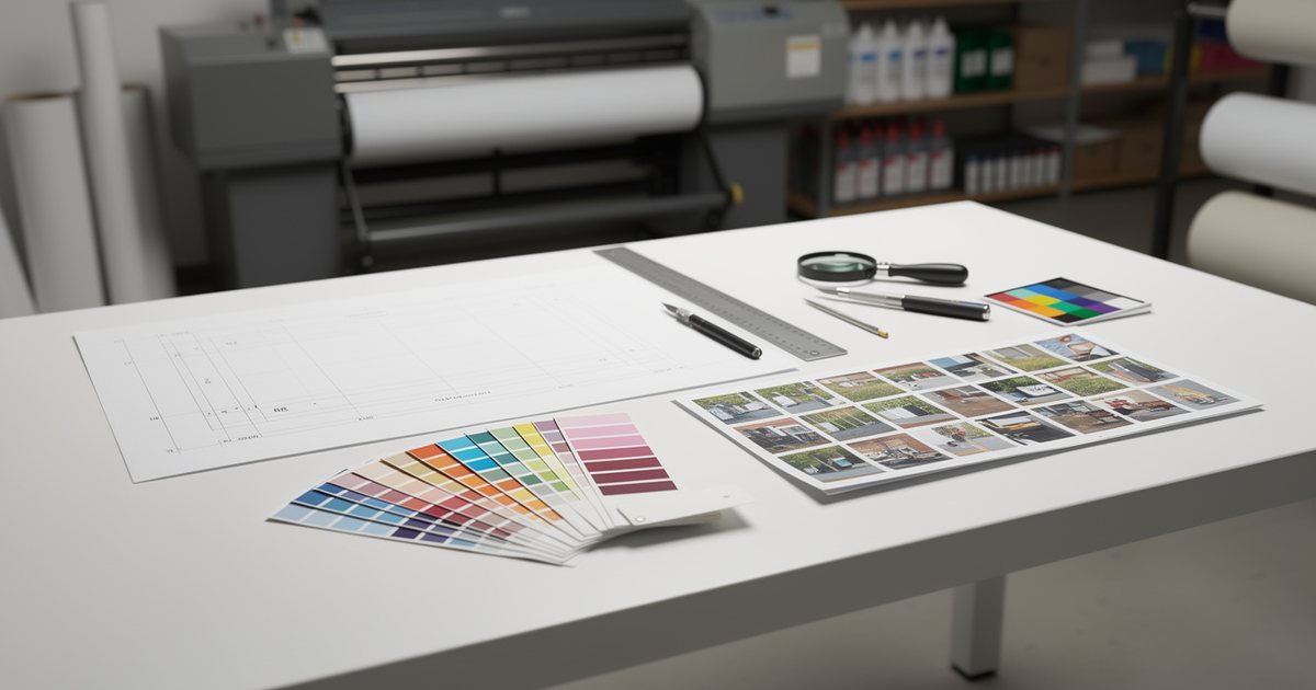
- Printed digital proof: a sample on similar paper gives a truer idea of color.
- Press proof: for large runs or color-critical work such as packaging and brand colors.
Test QR codes printed at their real size with more than one phone, and check text direction wherever Arabic and English sit together. Many printers treat your written approval of a proof as final sign-off on the content, so do not approve before a full review.
Paper and finishes: the basics
Paper weight is measured in grams per square meter (gsm). Common ranges, which vary between printers: letterheads 80 to 120 gsm, flyers 130 to 170, covers 250 to 350, business cards 300 to 400.
Coated paper (gloss, silk or matt) shows color with more saturation and sharpness. Uncoated paper absorbs ink, so colors look softer, but it is easy to write on and feels natural. Ask for paper samples before committing.
Finishes add value and cost:
- Lamination (gloss, matt or soft-touch) protects the piece and changes its feel.
- Spot UV adds a raised gloss to selected areas such as a logo.
- Foil stamping in gold, silver and other metallics.
- Embossing and debossing raise or press in part of the surface.
- Die-cutting creates non-rectangular shapes.
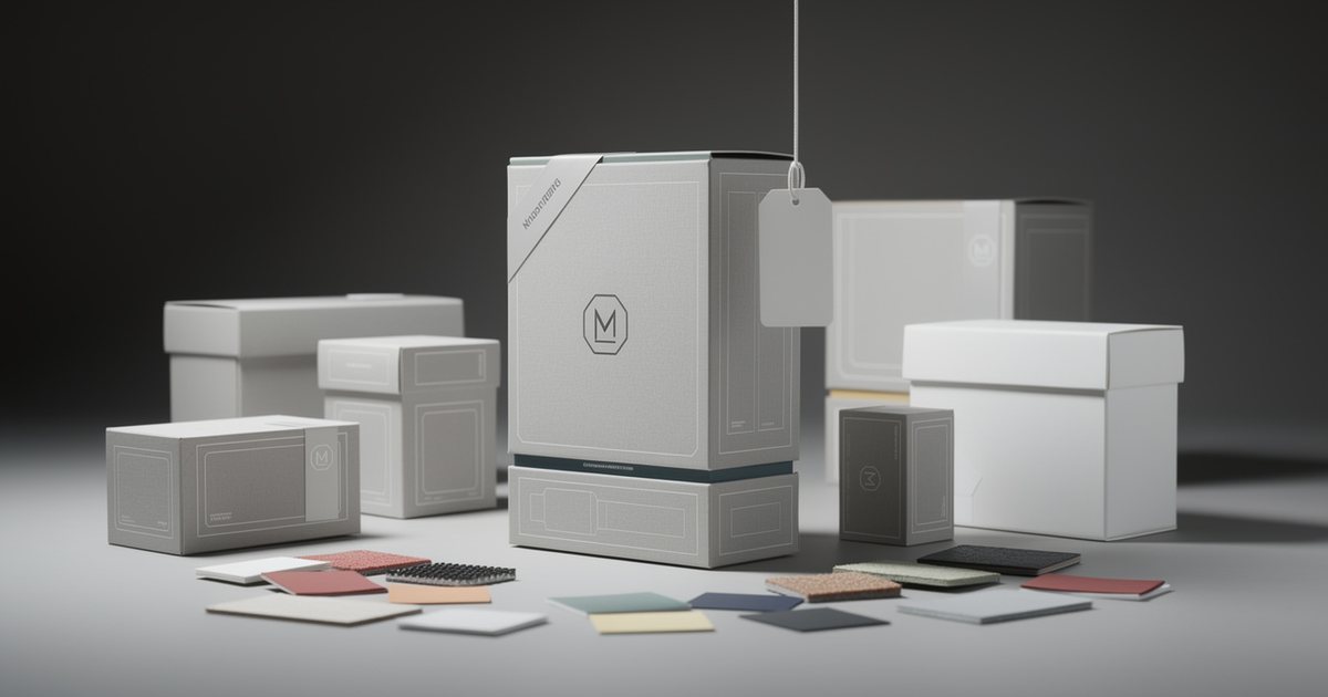
Each special finish usually needs its own file or layer marking the exact area in a single solid color, following the printer's instructions. Packaging and dielines add their own rules, covered in packaging design.
Checklist before sending to the printer
- Did you get the printer's specifications and follow them?
- Is the file in CMYK or the profile the printer specified, with brand colors at their approved values?
- Is every image around 300 PPI effective at final size, or at the printer's agreed minimum for large formats?
- Are logos and text vector?
- Did you add 3 mm bleed (or whatever is required) and keep key elements inside the safe margin?
- Are fonts embedded or outlined, and does the Arabic text survive export intact?
- Is black text K 100, and are dark areas built with the agreed rich black?
- Did you export the required PDF/X version with crop marks and run preflight?
- Did you review the proof, test QR codes and approve in writing?
- Are paper type, weight and finishes stated on the print order?