Brand Guidelines: Keeping Your Brand Consistent
Brand guidelines stop every supplier improvising with your brand. What a brand book should contain, how to make it something people actually use, and how to manage versions and updates.
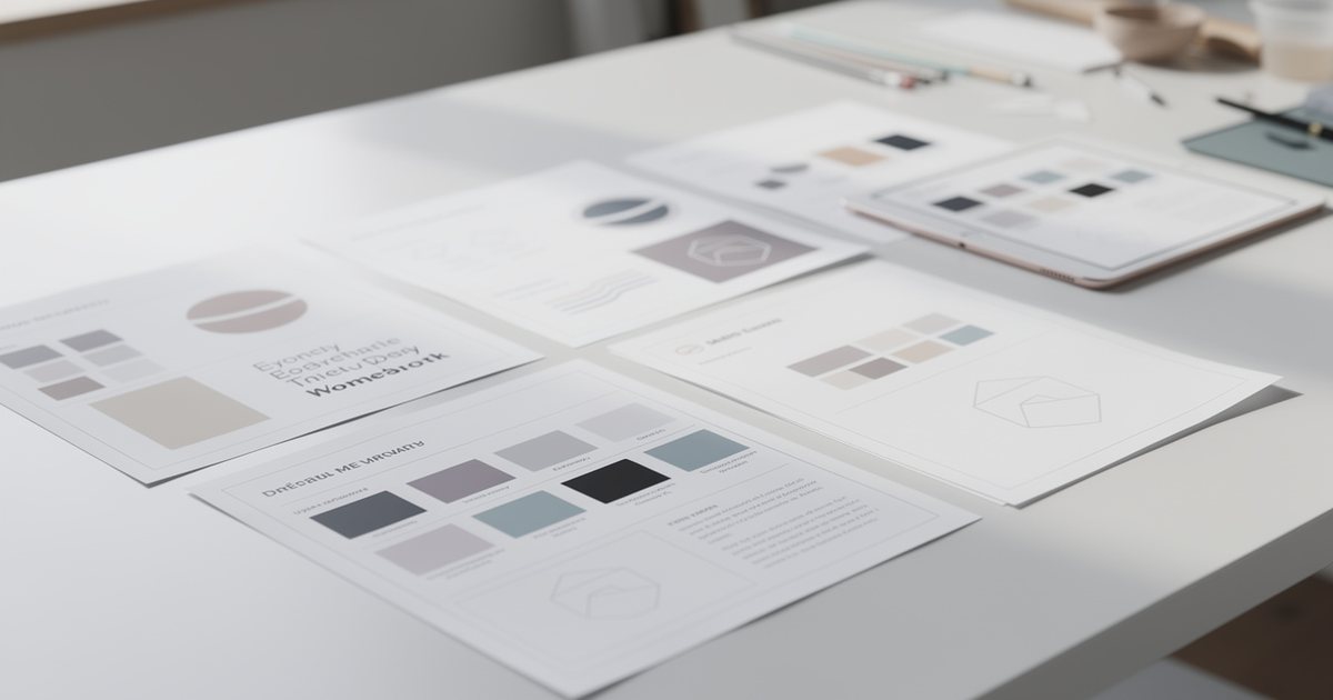
Brand guidelines, often called a brand book, are the reference that tells everyone producing material in your name how to use the brand's elements: designers, printers, social media managers and developers alike. Without them each supplier improvises, and your materials drift apart until they look like they belong to different brands. This guide covers what brand guidelines should contain, how to make them genuinely usable, and how to manage versions.
Building the identity itself, from research to logo and colors, is the subject of visual identity: what it includes and how to build it. Here the focus is on documenting and protecting that identity once it exists.
When you need brand guidelines
You need them as soon as more than one person produces material in your name. Signs include:
- You work with more than one designer, agency or printer.
- You have branches in several cities or countries, or distributors and resellers who use your logo.
- New staff are making presentations and posts.
- You have refreshed the identity and want the old look to disappear.
- You notice different versions of the logo circulating in the company's WhatsApp groups.
Even a small business benefits from a short version of a few pages. What matters is that the rules are written down, not that the document is large.
What brand guidelines contain
The logo: versions and usage
- Versions: the primary logo, horizontal or stacked versions, the symbol on its own for small spaces such as profile pictures and app icons, a single-color version, and a reversed version for dark backgrounds.
- Arabic and English: which version is primary, when they appear together, and in what order and spacing.
- Minimum size: in millimetres for print and pixels for screen. Below it, detail is lost, and very small uses may need a simplified version.
- Clear space: the empty area around the logo that nothing may enter. Define it with a unit taken from the logo itself, such as the height of a particular letter or the width of the symbol, so it scales with any size.
- Permitted backgrounds: which colors and images the logo may sit on, and in which version.
The reasoning behind these versions is covered in logo design principles.
Misuse examples
The misuse page is one of the most useful in any brand book, because a crossed-out image is clearer than any paragraph. Typical examples: stretching or squashing the logo, changing its colors, adding shadows, outlines or gradients, rotating it, changing the proportion between symbol and name or rearranging them, retyping the name in another font, placing it on a busy or low-contrast background, cropping it, and using an old version.
Colors and their codes
Each brand color gets up to four values:
- HEX for websites and apps.
- RGB for screens and presentations.
- CMYK for print.
- Pantone if the brand uses spot colors in print.
Do not derive CMYK values by automatic conversion from screen values. Test them in print, adjust and then approve them, as described in preparing print files. Also define the role of each color: the primary color for large areas, secondary colors, an accent reserved for buttons and calls to action, and neutrals for text and backgrounds. Add a small table showing which text and background combinations have enough contrast to read. For the theory behind color choices, see color theory.
Typography
- The Arabic and Latin families, and the weights used from each.
- The hierarchy: headings, subheadings, body text and captions, with example sizes and line spacing.
- Fallback fonts for office documents and email when the brand fonts are not available.
- Licensing: a desktop license is different from a web or app license. Record who holds the license, and do not send font files to suppliers until you have checked the license allows it.
- Arabic-specific rules: numeral style, use of kashida (letter stretching), and when diacritics are used.
For choosing Arabic typefaces and pairing them with Latin ones, see Arabic fonts in design.
Imagery, illustration and icons
- Photography style: lighting, color, composition and subject matter. Do the people shown look like your customers in the region, in suitable dress and settings? What should be avoided, such as generic stock photos that resemble no one you serve?
- Illustration: one consistent style rather than a mix of conflicting ones.
- Icons: stroke weight, corner style and size.
- Graphic elements and patterns, and how to use them.
- Usage rights: every image needs a clear license, as explained in image rights and licensing.
Tone of voice
A brand is read as well as seen. Describe its personality with clear pairs, such as "friendly, not overfamiliar; confident, not arrogant; clear, not technical." Then specify:
- The Arabic register for each channel: website, official documents, ads and customer replies. The brand makes this decision once and documents it, so it does not change with whoever is writing.
- The English tone, in the same way.
- A word list: preferred and banned terms, how the brand name is written in Arabic and English, and how currencies and numbers are written.
- Before-and-after examples of a message written off-tone and then rewritten.
Shaping the message itself is covered in crafting a clear marketing message.
Templates and applications
Business cards, letterheads, email signatures, a presentation template, social media templates (see designing social media posts), invoices, signage, vehicles, uniforms and packaging. Show each application in a realistic mock-up, and attach the editable file.
Making the guidelines usable
A brand book nobody opens protects nothing. So:
- Keep it short and visual. An example beats a paragraph.
- Explain the reason for each rule in one line. People follow rules they understand.
- Add a one-page summary: logo versions, color codes, fonts and the three most important don'ts.
- Attach an asset library: an organized folder with every logo version, color mode and format, named clearly by version, language and color mode, plus editable templates.
- Give each audience what it needs. Printers need CMYK, Pantone and print files; the social team needs templates; developers need HEX codes, fonts and spacing, the foundation of a design system as described in UI and UX design fundamentals.
- Name an owner: someone who answers questions, approves exceptions and reviews new material before it goes out.
Versioning and updates
- Put the version number and date on the cover and in every page footer.
- Add a change log at the end. Illustrative example: "Version 2.1: added Ramadan post templates; adjusted the secondary color's CMYK values after a print test."
- Keep a single source of truth: one fixed link that always points to the latest version, instead of PDFs passed around in chats. Mark old versions as archived.
- Tell suppliers about every update, with a summary of what changed.
- Set a transition period for old printed materials: use up remaining stock or replace it by a set date.
- Review the guidelines regularly, for example once a year, or whenever you add a new channel or product.
Common mistakes
- A document of dozens of pages that no one opens, with no summary page.
- A PDF on its own, with no logo files or templates.
- Rules without visual examples.
- Neglecting the Arabic side: no rules for the Arabic logo, no Arabic typeface specified.
- No owner, so exceptions become the rule.
- Guidelines never updated after launch.
Practical checklist
- Do the guidelines define the Arabic and English logo versions, minimum sizes and clear space?
- Is there a clear misuse page?
- Does every color have tested HEX, RGB and CMYK values and a defined role?
- Are Arabic and Latin fonts, fallbacks and licenses documented?
- Are photography style, icons and tone of voice defined with examples?
- Are the core templates attached as editable files?
- Is there a summary page, an organized asset library and a fixed link to the latest version?
- Does the cover show a version number and date, with a change log at the end?
- Is there a named owner for the guidelines and for exceptions?
When you hire a designer or agency, send the guidelines with your design brief from day one. For the general principles behind everything above, go back to Graphic Design: The Complete Beginner's Guide.