Visual Identity: What It Includes and How to Build It
A visual identity is a whole system, not just a logo. Learn its seven components and the five stages of building one: research, strategy, concepts, refinement and guidelines.

A visual identity is the visible system people use to recognize your brand: the logo, colors, typefaces, imagery style, icons and graphic elements, plus the rules for applying them to everything you publish. The logo is only one part of it. That is why so many business owners order "a logo" and, a few months later, find that every post, sign and invoice looks as if it came from a different company. This guide walks through each component, then the stages of building an identity from research to guidelines.
Brand, visual identity and logo are three different things
These terms get mixed up constantly, and separating them saves long debates with clients:
- Brand: the impression people carry about you, meaning what they expect from you and how they feel when they hear your name. It is shaped by product quality, service, price and how you treat customers, not by design alone.
- Visual identity: the visible layer that expresses the brand and makes it instantly recognizable.
- Logo: the most condensed element of the identity, effectively the brand's signature.
If the brand were a person, the brand would be their character and reputation, the identity their appearance and dress sense, and the logo their signature. A consistent tone of voice usually sits alongside the visual identity; see crafting a clear marketing message. One rule worth remembering: a strong identity cannot rescue a weak product, but a weak identity can hide a good one.
What a visual identity includes
The logo system
One logo file is not enough. A brand needs a primary version, horizontal and vertical versions for different spaces, a standalone symbol that works on its own as a social profile picture and browser icon, a one-color version and a reversed version for dark backgrounds. The system also sets the clear space around the logo and its minimum size. What makes the logo itself work is covered in logo design principles and common mistakes.
The color palette
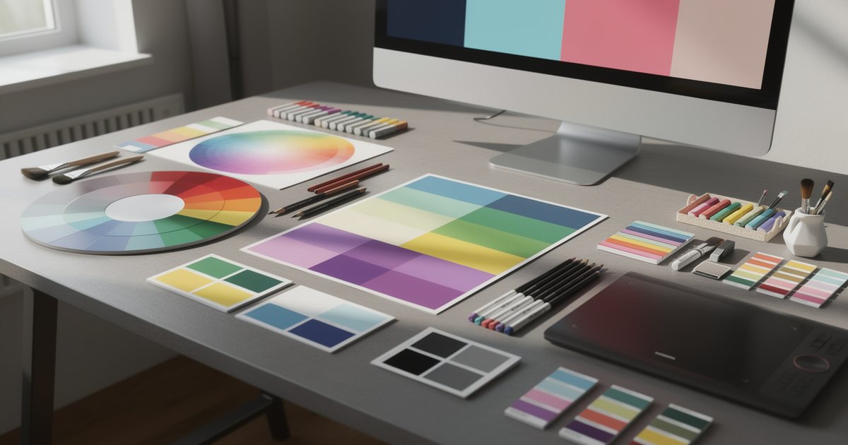
Usually one or two primary colors that carry the brand's personality, secondary colors for variety, and neutrals such as grays and a warm off-white for text and backgrounds. Digital products often add functional colors for error and success messages. Every color is specified in several systems: HEX and RGB for screens, CMYK for print, and a Pantone reference where a spot color must print precisely. Proportions matter as much as the colors themselves: which one dominates and which appears only in small doses. Choosing and combining colors is covered in color theory and color psychology.
Typography
A brand that speaks to Arabic and English audiences needs an Arabic type family and a Latin one that match in weight and character, with a defined role for each weight: headlines, body text and small captions. Check that each font license covers every expected use, including print, website, app and advertising. Choosing Arabic type and pairing it with Latin is explained in typography and Arabic fonts in design.
Imagery style
This defines the lighting, whether people or only products appear, the kind of backgrounds, the color treatment and what to avoid. Without it, every photographer shoots their own way and the brand's feed becomes a pile of unrelated pictures. Imagery direction also covers cultural norms around how people are shown and dressed, which is essential for Gulf audiences. If the brand relies on illustration, its style is described the same way.
Iconography
A consistent icon set with one stroke weight, one corner radius, one base grid and one style, either outline or filled. Few things look less professional than icons pulled from different sources on the same page, each with its own weight, size and feel.
Patterns and graphic elements
The shapes, frames, dividers and patterns that make a design recognizable even when the logo is absent. They can be derived from the logo itself or from local visual heritage such as Islamic geometric patterns or Sadu weaving motifs. Use that heritage with an understanding of what it means and with a contemporary simplification, so it does not turn into the same decoration everyone else uses.
Applications
Every place customers meet the brand: business cards and invoices, social templates, the website, signage, vehicles, uniforms, packaging, presentations and email signatures. Prioritize by real touchpoints. A home-based sweets business selling through Instagram and WhatsApp first needs a clear profile picture, story highlight covers, WhatsApp catalog images and a sticker for its boxes; letterhead can wait. Packaging has its own rules, covered in packaging design.
How to build a visual identity, step by step
1. Research and discovery
An identity starts with questions, not sketches. What do you offer, to whom, and why would a customer choose you over the alternatives? Who are the competitors, and what are the plans for the next few years? Will the business expand to another country or add product lines? Then lay out competitors' logos and colors on one board. You will usually spot patterns, such as every clinic in an area using blue and teal, and that sameness is an opening. Capture all of this in a written brief, as described in how to write a design brief.
2. Strategy
Turn research into decisions: a positioning statement that places the brand in its market, and three to five personality traits such as "warm, trustworthy, contemporary". Calibrate each trait with a limit so it cannot be misread: "contemporary, but not loud". Then translate traits into visual choices; "premium" usually means fewer colors, more white space and refined type. The sharper the audience definition, the clearer these decisions become, as explained in defining your target audience and buyer personas.
3. Concepts and directions
Build a moodboard for each direction, then develop two or three genuinely different directions rather than variations on one idea. Show the logo in black and white first so its form is judged before its color, then show it applied to realistic mock-ups: a cup, a sign, a post, a profile picture.
4. Development and refinement
Once a direction is chosen, test it hard: at its smallest size, on photographic backgrounds, in Arabic and English together, and in a real print proof. Then build the rest of the system: final colors, type hierarchy, icons and the templates people will use every day.
5. Guidelines and handover
Document every rule in clear guidelines, a topic of its own in brand guidelines: keeping your brand consistent. The handover package includes vector and raster logo files in every version, color values, fonts and their licenses, social and presentation templates, and the icon library, in well-organized folders with clear names.
| Component | What to deliver | Common mistake |
|---|---|---|
| Logo | Vector and raster files for every version | Handing over a single PNG |
| Color | HEX, RGB and CMYK values plus proportions | Colors that shift between print and screen |
| Typography | Family names, weights and licenses | An Arabic font not licensed for commercial use |
| Imagery | Examples of what is in and what is out | Stock photos that look nothing like the brand |
| Icons | One consistent vector library | Icons collected from random sources |
Bilingual identities
Most brands in the Gulf and Egypt need a name and logo in both Arabic and English. First decide whether the English name translates the meaning or transliterates the Arabic sound, then design both versions together from the start, instead of designing one and "adding" the other later. The two should match in visual weight and character, and their arrangement should be defined for every lockup, with Arabic usually placed on the right or on top. Check your municipality's signage rules as well, since some authorities set requirements for the use of Arabic on shop signs.
Common mistakes when building an identity
- Drawing the logo before strategy and audience are agreed.
- Copying the category leader, so the new brand looks like a faded version of it.
- Choosing many colors and no neutrals, which makes balanced layouts almost impossible.
- Pairing an Arabic font that clashes with the Latin one, or using a font without a commercial license.
- Skipping real-world tests, such as a circular profile picture that crops the edges of the logo.
- Having no guidelines, so the identity falls apart within months as different designers touch it.
- Changing the identity every year instead of giving it time to settle in people's memory.
Practical checklist
- Were the strategy and personality traits written down before design started?
- Does the logo have primary, horizontal and vertical versions, a standalone symbol and a one-color version?
- Are colors defined in HEX, RGB and CMYK, with proportions?
- Are the Arabic and Latin fonts compatible and licensed for every use?
- Are imagery, icons and graphic elements defined with examples?
- Has the identity been tested on the brand's five most important real touchpoints?
- Is everything documented in guidelines and delivered in organized folders?
For the principles underneath all of these decisions, go back to the complete beginner's guide to graphic design.