Logo Design: Principles and Common Mistakes
What makes a logo work? Five principles, five logo types, the file formats you should insist on, and the mistakes that send business owners back to the drawing board.

A good logo is recognized quickly, stays clear as a tiny icon on a phone screen and on the front of a building, works in a single color, and lasts for years without looking dated. It does not need to explain everything the company does; its job is to distinguish the business and be remembered. This guide covers the core logo design principles, the main types of logo and when each fits, the files you should receive, and the most common mistakes with ways to avoid them.
What a logo is for, and what it is not for
Many clients want the logo to carry everything: a dental clinic asks for a tooth, a smile, a star and the city skyline in one shape. The result is usually a crowded drawing that cannot be read at small sizes and does not stick in memory. A logo identifies rather than describes. It is a mark that people connect with their experience of the business, and its meaning builds over time. A distinctive mark that suits the sector beats a literal picture of the product.
A logo also never works alone. It lives inside a system of colors, type and graphic elements, explained in visual identity: what it includes and how to build it. A logo that looks ordinary on its own can become strong when a consistent identity carries it.
The five principles of a good logo
Simplicity
A simple shape is recognized faster, remembered longer, and can be embroidered, engraved or stamped without losing its features. A practical test: show the logo to someone for a few seconds, then ask them to draw it from memory. Any part they cannot recall is probably unnecessary.
Scalability
The same logo will appear at 16×16 pixels in a browser tab and across a billboard several meters wide. Thin lines and small gaps disappear or fill in when reduced, especially on absorbent paper or in embroidery. If the primary logo is detailed, design a simplified version for small sizes, and set a minimum size for each version, in millimeters for print and in pixels for screen.
Versatility
The logo has to work in one color, black on white and white on black, over photos, and on different materials: uniform fabric, a plastic bag printed in a single color, a rubber stamp, laser engraving. It also has to survive being cropped into a circular profile picture and a square app icon. Design in black first and add color later; a logo that only works with its gradients and effects is fragile.
Timelessness
Design fashions move fast: particular gradients, long shadows, typefaces that are everywhere for a season. A logo built on a passing trend looks dated when the trend ends. Ask yourself whether it will still look acceptable in ten years. A logo can be refreshed later, but frequent changes erase what has built up in people's memory.
Relevance
The logo should suit its sector, audience and brand personality; what works for a children's nursery does not work for a law firm. Relevance is cultural too. Check that the shape carries no unintended meaning for your audience, that letters do not read as another word from right to left or left to right, and treat religious and national symbols with care and respect.
Logo types and when to choose each
| Type | Description | Best for |
|---|---|---|
| Wordmark | The brand name in a distinctive or custom-drawn typeface | Short, distinctive names |
| Lettermark | One letter or initials from the name | Long or compound names |
| Symbol | A pictorial or abstract shape with no text | Established brands, or as part of a system |
| Combination mark | Symbol plus brand name | Most new businesses |
| Emblem | Text inside an enclosing shape, like a seal | Universities, clubs, cafés, heritage-style products |
A combination mark is usually the safest choice for a new business: it teaches people the name and the symbol together, and the symbol can later appear alone in small spaces once it is known. A standalone symbol needs time and investment before people recognize it without the name. Emblems look great at large sizes, but their inner text becomes unreadable when small, so they need a simplified version.
Arabic calligraphic wordmarks
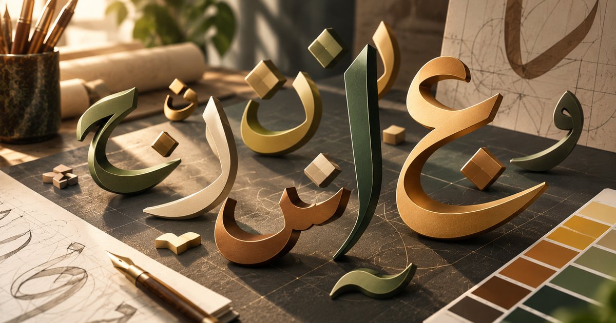
Arabic letterforms offer rare flexibility: stacking, overlapping and extension, and compositions inspired by Thuluth, Diwani or Kufi. That is a real opportunity for a distinctive mark, on two conditions. The word must remain readable to an ordinary Arabic reader, and letter-construction rules must be respected, so no invented shapes that only look Arabic. Bilingual brands need the Arabic and Latin versions designed together with matching weight and character; the details are in typography and Arabic fonts in design.
Logo files you should receive
- Master vector file: AI, PDF or EPS, the reference everything else is derived from.
- SVG: a vector format for websites and apps that stays sharp on every screen.
- PNG with a transparent background: several sizes for everyday use in presentations, documents and social media.
- JPG: only where transparency is not needed.
- Square symbol versions: for browser icons, profile pictures and app icons, at the sizes each platform specifies.
- Color versions: full color, black, white and single color, in RGB for screens and CMYK for print.
Make sure any text in the logo file has been converted to outlines, so the lettering does not change when the file is opened on another machine. If all you have is a small JPG, do not rely on auto-tracing; have the logo carefully redrawn as a vector. Sending the logo and other artwork to a printer is covered in preparing print-ready files.
Common mistakes and how to avoid them
Too much detail
Shadows, gradients, hairlines and lots of small elements look impressive on a big monitor and turn into an unreadable blob in a profile picture. The fix: keep removing things until the next removal would hurt.
Chasing trends
Copying this year's popular style stamps the logo with the year it was made. The fix: build the logo on a strong shape and balanced lettering, and leave trendy effects to campaigns and posts, which change anyway.
Raster logos
A logo made in a photo editor, or delivered only as a PNG, falls apart when enlarged for a sign or a vehicle wrap. The fix: make vector master files a condition of the agreement, not an afterthought.
Too many colors
Every extra color raises the cost of screen printing and embroidery and increases the chance of colors drifting between suppliers. The fix: a logo that works with two colors at most and still reads in one. Choosing those colors is the subject of color theory and color psychology.
Copying and templates
Imitating a competitor's logo, buying a template that others may also use, or adopting an auto-generated logo without checking its originality. All of these weaken distinctiveness and can lead to a legal dispute or a refused trademark application. The fix: an original idea, a search of the trademark database held by the competent office in your country before you commit, and advice from a legal professional when in doubt.
Unlicensed fonts
Using a font that is free for personal use only in a commercial logo. The fix: check the license before you start, or modify the letters enough that they become a drawing unique to the brand.
How to test a logo before approving it
- Small-size test: view it at browser-icon size and print it about 15 mm wide.
- One-color test: black on white, white on black, and over a busy photo.
- Squint test: look at it through half-closed eyes or from across the room. Is the overall shape still distinctive?
- Context test: apply it to realistic mock-ups: a circular profile picture, a shopfront, a uniform, a delivery bag, a phone screen.
- Reading test: ask Arabic and non-Arabic readers to read the name aloud, and check for unintended readings.
- Memory test: show it for a few seconds, then ask people to sketch it.
- Similarity test: run an image search and a trademark database search for accidental resemblance to existing marks.
If you plan to animate the logo later for video intros, keep its elements on separate layers and read kinetic typography and logo animation.
Practical checklist
- Is the logo distinctive and right for the sector, without trying to explain everything?
- Does it stay clear at browser-icon size and when printed about 15 mm wide?
- Does it work in one color, reversed, and over photos?
- Does the primary version use two colors at most?
- Are the Arabic and Latin versions balanced and readable?
- Have you received vector and raster files in every color version?
- Have you checked font licenses and searched for similar registered marks?
- Are the usage rules documented in your brand guidelines?
For the bigger picture of design fields and workflow, see the complete beginner's guide to graphic design.