Kinetic Typography and Logo Animation: A Practical Guide
How to animate words and logos without sacrificing readability or brand identity: timing to sound, Arabic letterforms, logo reveal types and the right format for each use.
Kinetic typography is animated text in which the motion carries part of the meaning: the important word arrives bigger, faster and exactly when the voice says it. Logo animation brings a company's mark to life in a few seconds, in a way that expresses the brand's personality and ends on the logo exactly as it is. Both share two conditions: readability first, and loyalty to the visual identity always. This guide covers timing text to voice and music, readability rules, the particular demands of Arabic letterforms, the main types of logo reveal, and delivery formats.
What kinetic typography is and when to use it
In kinetic typography the words are the picture. Businesses use it in many places:
- Social media ads: many videos are watched without sound, so moving text carries the whole message.
- Quote and message videos: a CEO's statement, or a greeting for Ramadan and Eid.
- Parts of an explainer: to highlight a figure, a benefit or the product name.
- Event and presentation openers: big titles moving to the music.
- Broadcast graphics: titles, lower thirds and program openers.
There are two broad kinds: text synced word by word to a voice-over or a track, and text used as a standalone design element, such as headlines and figures. Common techniques include words popping on, lines revealed through a mask, the key word scaling up, a camera traveling across text laid out in space, words rotating to form the next line, and one word morphing into another.
Syncing text to voice and music
With a voice-over
Record the final voice-over first, then add timeline markers at every important word or phrase. A key word should appear as it is spoken, or a fraction of a second before, never after; text that lags behind the voice makes viewers feel something is broken. Don't animate every single word unless the piece is designed that way. Show the whole phrase and emphasize one or two words through size, weight or color.
With music
Music gives you a ready-made time grid. Work out frames per beat with this formula: (60 ÷ beats per minute) × frame rate. For example, a track at 120 BPM has a beat every half second: every 12 frames at 24 fps, or every 15 frames at 30 fps. That arithmetic tells you where the strong beats fall so you can land big changes on them.
Don't move something on every beat, though; the result is exhausting. Save the strong beats for major changes and leave quieter stretches in between. For speed curves and rhythm, see timing, spacing and easing; for the relationship between motion and audio, see sound design for motion graphics.
Readability first: rules for moving text
Moving text that can't be read has failed, however beautiful it is. The essentials:
- Motion ends before reading starts: text moves in and then holds; reading happens during the hold, not during the movement.
- Enough time on screen: a simple test is to read the phrase aloud twice at normal speed. If it disappears before you finish, it's too short.
- One phrase at a time: two lines moving at once compete for the eye.
- Size and weight: avoid very thin weights and small sizes in video that will be watched on phones.
- Contrast: light text over a light moving background vanishes, so add a soft shadow or a backing strip when needed. Color choices are covered in color theory.
- Safe zones: in vertical video, keep text clear of the areas covered by platform buttons and captions.
- Flashing: avoid rapid, repeated flashing. Web accessibility guidelines say content should not flash more than three times in any one second, because it can trigger seizures in some viewers. On websites, also respect the user's reduced-motion setting, as explained in web accessibility.
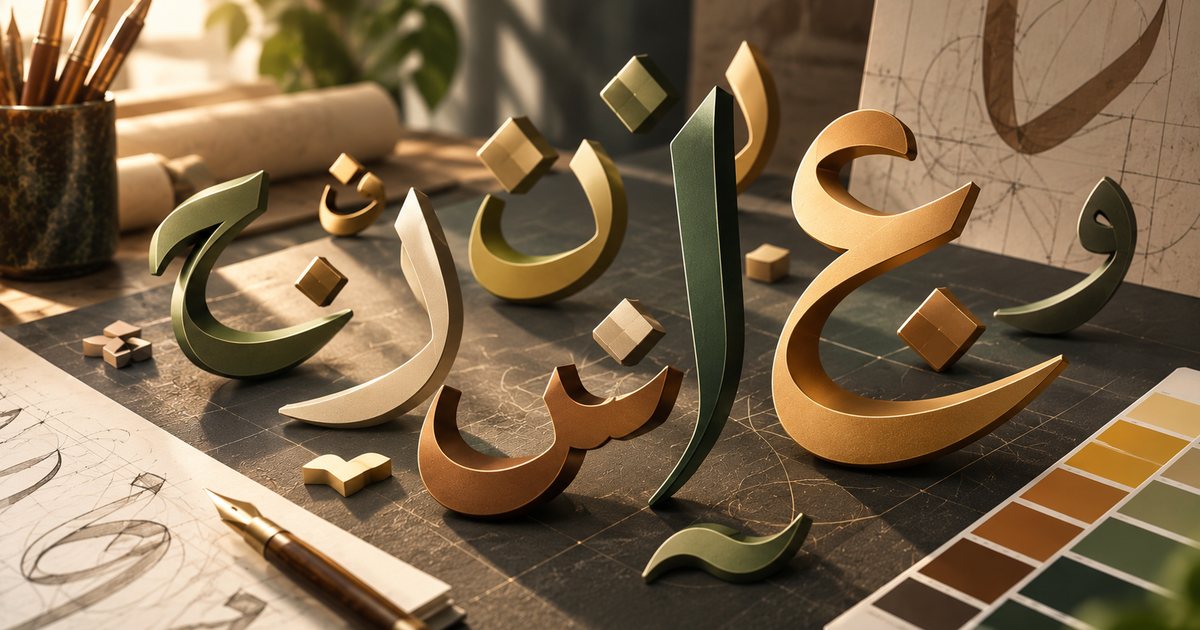
Animating Arabic letterforms and direction of motion
Arabic script is cursive, and each letter changes shape depending on whether it sits at the start, middle or end of a word, or stands alone. That means not every Latin text trick carries over:
- Avoid animating letters individually: in some tools, animating each character separately breaks the joins or shows letters in their isolated forms. Animate by word or by line, and always test before building on a technique.
- Use a mask instead of a typewriter effect: a letter-by-letter reveal can be imitated with a mask that uncovers the word from right to left, keeping the letters joined.
- Write-on reveals: revealing strokes progressively in the direction of writing suits Arabic beautifully, especially calligraphic styles. To look natural, follow the order of handwriting: the main skeleton of the word first, then dots and vowel marks.
- Dots and diacritics: if you split letter parts onto separate layers, make sure dots and marks travel with their letters and don't drift.
- Kashida (elongation): some designers use the stretched connecting stroke as a motion device, as long as it stays within the logic of the typeface; arbitrary stretching hurts readability.
As for direction, Arabic readers start on the right. Text reveals from the right, sequential elements enter from right to left, and progress bars advance to the left. Note that numbers inside Arabic text run left to right, as do embedded English words, so check the direction of every part when animating counters or mixed-language lines.
In bilingual projects, build the Arabic version as its own layout rather than an automatic mirror. Flip the text and motion direction, leave logos and product shots unflipped, and pair an Arabic typeface that matches the Latin one in weight and character. Font selection is covered in typography and Arabic fonts in design.
Logo animation: common reveal types
| Reveal type | How it works | Suits |
|---|---|---|
| Line draw | The logo's strokes draw on, then fill | Line-based and calligraphic logos |
| Build | Separate parts fly in and assemble | Logos made of distinct shapes |
| Mask reveal | The logo is uncovered from behind a shape or line | Sober, corporate brands |
| Morph | A simple shape or symbol transforms into the logo | Marks with a story or symbol behind them |
| Particles | Particles gather into the logo or scatter from it | Tech brands and events |
| 3D | The logo turns or is lit in three-dimensional space | Fragrance, automotive, luxury |
| Light sweep | A light passes across the static logo | Ad end cards, premium brands |
| Fade and scale | A gentle fade with a slight scale | Conservative organizations, frequent use |
| Glitch | Deliberate digital breakup and distortion | Gaming, tech, youth brands |
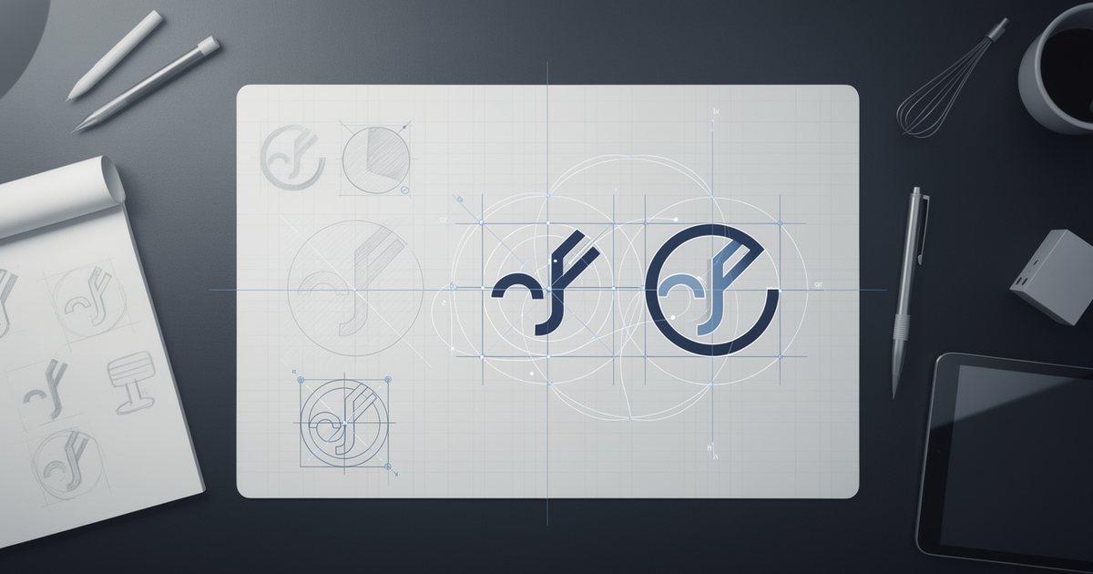
The choice starts with how the logo is built and the brand's personality. A logo made of clear parts assembles easily, a line logo draws on, and an Arabic calligraphic logo writes itself in the direction of writing. In every case, the foundation is a well-designed mark, as covered in logo design principles and common mistakes.
Staying consistent with the brand
- An exact final frame: the last frame must match the static logo in color, proportion and clear space, with no differences at all.
- Don't distort the mark: squash, stretch or bending on the logo itself is off-limits unless the brand guidelines allow it; put the energy into the surrounding elements.
- Documented motion language: add a motion section to your brand guidelines covering approved durations, easing style, entry and exit directions, and any sound that accompanies the logo.
- Multiple versions: a short version for video end cards and social, a longer one for openers and events, versions for light and dark backgrounds, for horizontal, vertical and square formats, with and without sound.
- Continuity across teams: hand over the open project files and motion specs to any agency or freelancer who works on the brand later, so nobody reinvents a different animation.
Nearly all of the 12 principles of animation apply here within a few seconds, especially timing, staging and appeal.
Delivery formats
| Format | Use | Transparency | Notes |
|---|---|---|---|
| MP4 (H.264) | Websites, social platforms, presentations | No | Widest compatibility, reasonable size |
| MOV (ProRes 4444) | Editing and broadcast | Yes | High quality, large files |
| PNG sequence | Compositing and editing | Yes | One file per frame |
| WebM (VP9) | Websites | Yes | Browser support for transparency varies, so test |
| GIF | Email signatures, simple uses | Hard-edged only | 256 colors at most, large for its quality |
| Lottie (JSON) | Apps and websites | Yes | Lightweight, scalable vector animation |
Lottie deserves a closer look. It describes the animation in a JSON text file that apps and websites read and draw as vector graphics, so files stay small and crisp on any screen. It is usually exported from After Effects through dedicated plugins, or built in tools that support it, but it doesn't support every effect and feature, so design within its limits in coordination with the developers and test on real devices. Motion inside interfaces is covered in motion design in websites and apps, and video export in general in video export settings.
Common mistakes
- Text that keeps moving while people try to read it.
- A different effect on every word.
- Animating Arabic letters individually and breaking their joins.
- Revealing Arabic text from the left.
- A logo that ends with proportions or colors that differ from the official one.
- A long logo sting that delays the content at the start of every video.
- Delivering a single file with no versions for other sizes and backgrounds.
Practical checklist
- Was the voice-over recorded or the music chosen before animation began?
- Do key words appear as they are spoken, not after?
- Does every piece of text hold long enough to be read twice?
- Is the text legible on a phone in size and contrast?
- Does Arabic text animate by word, line or mask, with letters kept joined?
- Does motion in the Arabic version run right to left?
- Does the logo end as an exact match of the static version?
- Is the motion language documented in the brand guidelines?
- Have all required versions been delivered in the right formats, sizes and backgrounds?
With this checklist, text stays readable and the logo stays true to its identity, whatever style you choose. For the broader framework covering every kind of motion work, see the complete guide to animation and motion graphics.