Responsive Web Design: One Site for Every Screen
One website that adapts to phones, tablets and desktops. Learn the foundations of responsive design, the practical decisions behind it, right-to-left considerations and how to test it.
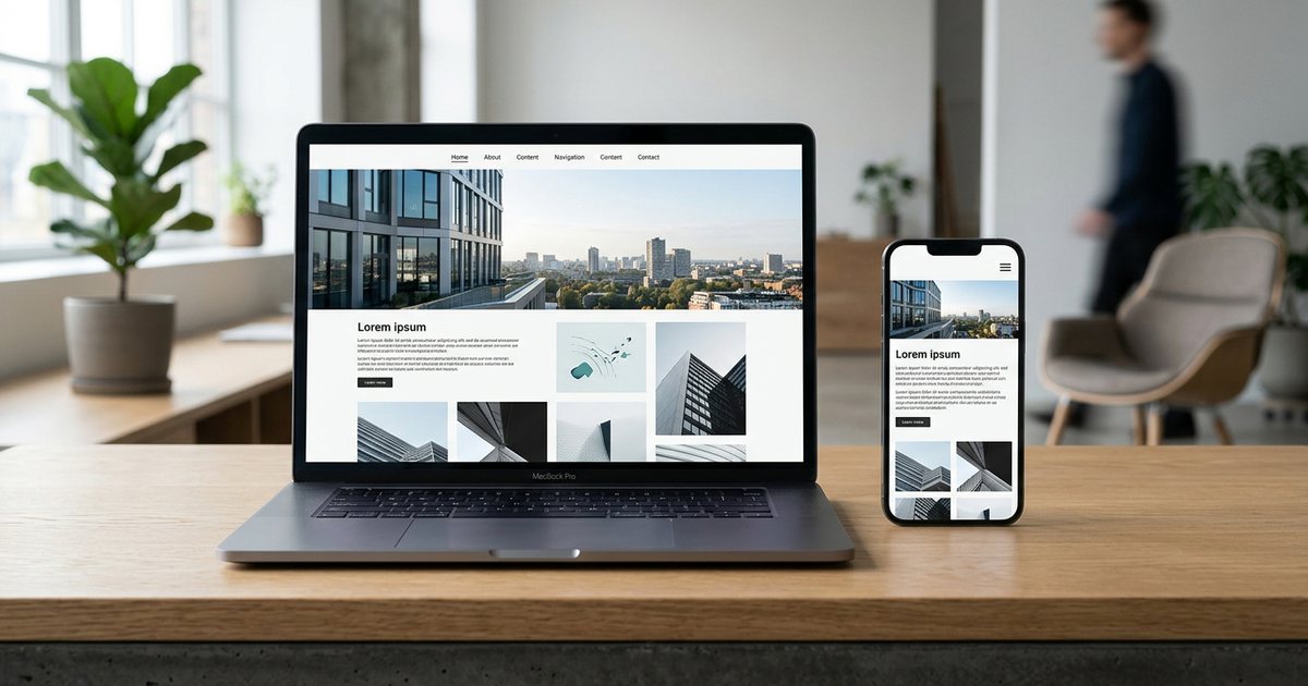
Responsive web design means building one website whose layout adapts to the screen width, so the same content is presented comfortably on a phone, a tablet, a laptop and a large monitor. It rests on three foundations: a fluid layout that stretches and shrinks, flexible media that never overflows its container, and media queries that change the layout when needed. Since the phone is the first screen for many visitors, responsiveness is now a basic requirement for any site rather than an extra. This article covers the foundations, the practical decisions, Arabic considerations and how to test.
Why one responsive site?
Some businesses used to build a separate mobile site on a subdomain, which doubled maintenance and let content drift apart between the two versions. A responsive site has one URL, one codebase and one set of content, so every change shows up on every device.
There's also a search reason: Google uses mobile-first indexing, meaning it primarily uses the mobile version of a page for indexing and ranking. Content you remove from the mobile version may not count for you. The details are in technical SEO basics.
Visitors also move between devices. They see your ad on their phone in the evening, then come back from a work laptop to request a quote, and they should get the same experience both times. Check your analytics to see the device split on your own site rather than relying on impressions. And if you're wondering whether you need an app instead of a website, read app or website?.
The three foundations
Fluid layout
Use relative units instead of fixed widths: percentages, the fr unit in grids, and rem for spacing and type. Set a maximum width for text so lines don't stretch across a wide screen and tire the reader, and let Flexbox and Grid distribute the elements. The rule: a container doesn't impose a fixed pixel width; it fills the available space up to a sensible limit.
Flexible media
Images, video and embedded frames must never be wider than their container. For images, one line of CSS setting max-width to 100% with automatic height is enough. For video and embedded maps, use the aspect-ratio property to keep proportions. And don't make phones download the large desktop image: the srcset and sizes attributes let the browser choose the right file, as explained in website speed. If you need a different crop on mobile, such as a wide landscape image that becomes a portrait one, use the picture element.
Media queries
Media queries are conditions in CSS that apply certain rules once the screen passes a given width. Before any query, though, you need the viewport meta tag in the page head, or phones will render the page at a shrunken desktop width:
<meta name="viewport" content="width=device-width, initial-scale=1">Then start with the mobile layout and add columns as the screen gets wider:
.cards { display: grid; gap: 1rem; }

@media (min-width: 40em) {
  .cards { grid-template-columns: repeat(2, 1fr); }
}

@media (min-width: 64em) {
  .cards { grid-template-columns: repeat(3, 1fr); }
}
In many cases a grid can adapt without any query at all, fitting as many cards as the row allows:
.cards { display: grid; gap: 1rem; grid-template-columns: repeat(auto-fit, minmax(min(16rem, 100%), 1fr)); }Container queries let a component adapt to the width of the container it sits in rather than the screen. They're useful for components that appear in different places, such as a card that sits in a narrow sidebar on one page and a wide area on another. Check support in the browsers your audience uses before relying on them.
Mobile-first
Mobile-first means designing and coding for the small screen first, then adding enhancements for larger screens, as in the example above. The benefit isn't only technical: a small screen forces you to set priorities. What does a visitor see on the first screen of their phone? Ideally a clear sentence saying what you offer, the main action such as a WhatsApp or call button, and one element of proof that builds trust.
Practical mobile decisions:
- Don't delete important content; rearrange it. Long sections can become collapsible panels, and tables can become cards.
- A collapsed menu is fine on mobile, but keep the main call to action visible outside it.
- A sticky bottom bar with call and WhatsApp buttons helps many local businesses, as long as it's slim and doesn't cover content or form buttons.
- Full-screen pop-ups on mobile are irritating and hide the content the visitor came for.
Breakpoints: let the content decide
A breakpoint is the width at which the layout changes. Don't design for specific phone models; they change every year. The sturdier method is to widen the browser window gradually and, when the layout starts to strain (lines too long, cards drifting apart), add a breakpoint there. Illustrative example of common breakpoints: around 600, 900 and 1,200 pixels, but your content should decide.
A few more tips:
- Write breakpoints in em so they behave correctly when visitors enlarge their text.
- Test the widths between breakpoints, which is where most problems hide.
- Remember tablets in both portrait and landscape, and very large screens that need a maximum content width.
Touch and forms on mobile
A finger is less precise than a mouse pointer, and phones have no hover. So:
- Generous touch targets: major platform guidelines suggest a touch area of roughly 44 to 48 pixels for important buttons and links, and the WCAG 2.2 accessibility guidelines set a minimum of 24 pixels with enough spacing between targets.
- Nothing that depends on hover alone: a submenu that only appears on hover is unreachable on a phone.
- The right keyboard: phone, email and number fields with the correct HTML input types bring up the matching keyboard, and the autocomplete attribute enables autofill.
- Form field text size: some mobile browsers zoom in automatically when you focus a field with small text; 16 pixels for inputs avoids this.
- Don't block zoom: disabling zoom in the viewport tag hurts people with low vision and is one of the common web accessibility mistakes.
- Wide tables: put them in a horizontally scrollable container, or turn each row into a card on small screens.
Arabic and right-to-left layouts
Responsive design for an Arabic or bilingual site brings extra considerations:
- Direction at the root: set dir to rtl on the html element for the Arabic version, and Flexbox and Grid flip automatically.
- Logical properties: use margin-inline-start, padding-inline-end and similar properties instead of left and right, so the same rule works in Arabic and English.
- Directional icons: next, previous and back arrows must mirror, while logos and icons that don't indicate direction stay as they are.
- Numbers and mixed text: phone numbers and Latin names inside an Arabic sentence can display in a confusing order if they aren't isolated. Test with real content.
- Arabic type size: Arabic text often needs a slightly larger size and more line height than Latin text to be comfortable on a phone screen.
- Long words and links: a long email address or URL can force horizontal scrolling; the overflow-wrap property lets it break.
- Different lengths across languages: a button that fits an English word may be too tight for its Arabic equivalent or vice versa, so design components to stretch.
The full picture of building both versions is in building a bilingual Arabic-English website.
Test on real devices
Device mode in browser developer tools is useful for quick checks, but it doesn't reveal everything: real touch accuracy, performance on a mid-range phone's processor, browser toolbars that change the available screen height as you scroll, and the on-screen keyboard covering a field while you type. That's the source of the common problem with elements set to the full screen height; the fix is to avoid depending on it or to use dynamic viewport units such as dvh.
A reasonable minimum set of devices: a mid-range Android phone, an iPhone, a tablet, a laptop and a large monitor, with more than one browser. What to check on each:
- No horizontal scrolling on any page.
- Text is readable without zooming, and buttons are easy to tap.
- Forms can be filled in with the keyboard open, and the submit button stays visible.
- The menu opens and closes, and the main call to action is visible.
- Images are sharp and undistorted, and sticky elements don't cover content.
- The page holds up in landscape and with text enlarged to 200%.
- Real content in both languages fits, including the longest product name and heading.
Also try the site on a slow connection using the network throttling option in developer tools. A page that adapts its layout but stumbles while loading isn't truly responsive.
Common mistakes
- Horizontal scrolling caused by a fixed-width element: a table, an embed, an image or a long word.
- Text baked into images, which can't reflow, is unreadable on a phone and is invisible to search engines.
- Hiding important content on mobile instead of rearranging it.
- Designing only two sizes and leaving everything in between to chance.
- A slider at the top of the mobile page that delays content and eats the first screen.
- Relying on the designer's desktop preview without trying the site on a real phone.
Practical checklist
- Add the viewport meta tag, start your CSS with the mobile layout and add rules for larger screens.
- Use relative units, Flexbox and Grid, and cap the width of text.
- Make images flexible and serve each screen an appropriately sized file.
- Choose breakpoints based on content, write them in em, and test the widths in between.
- Keep touch targets generous, don't rely on hover, and never block zoom.
- Use logical properties and mirror directional icons in the Arabic version.
- Test on real devices with real content in both languages.
- To see where responsive design fits in the full project, go back to building your business website, and see UI and UX design fundamentals for the interface principles themselves.