Composition Rules in Photography
Practical tools for arranging the frame and leading the viewer's eye to your subject, with tips for advertising photos that will carry text.
Photography composition rules are practical tools for arranging what goes inside the frame so the viewer's eye lands where you want it. They are not laws; they are tested shortcuts to a clear, balanced image, and you can break them on purpose once you understand them. This article covers the rules that matter most in commercial work, when each one helps, and a quick way to check the frame before you press the shutter.
Why composition matters
People look at a photo for a few seconds, usually on a phone screen, in a feed full of other pictures. If they cannot tell at once what the photo is about, they scroll on. Good composition therefore aims for three things: an unmistakable subject, a visual path that leads the eye to it, and a frame free of distractions. These principles are shared with graphic design, and the theory behind them is covered in Visual Hierarchy and Composition. Composition is also one of the five core skills in our photography fundamentals guide.
The rule of thirds
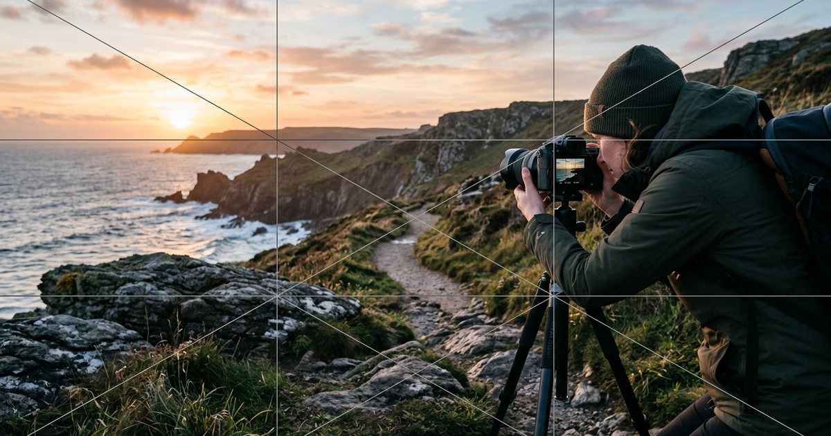
Imagine two horizontal and two vertical lines dividing the frame into nine equal parts. The rule suggests placing important elements along those lines or at their intersections rather than dead center. The result usually feels more dynamic, because the uneven space around the subject creates a comfortable visual tension.
In practice:
- Horizon: put it on the upper line when the land or sea matters more, and on the lower line when the sky is the star, such as a sunset over the corniche in Abu Dhabi or Doha.
- Portraits: place the eyes near the upper line.
- Gaze and movement: leave space in front of the person, in the direction they are looking or moving. Someone facing the near edge of the frame looks boxed in.
Turn on the grid overlay in your camera or phone; it also helps you keep horizons straight.
Leading lines
Roads, pavements, railings, corridors and rows of columns are all lines the eye follows automatically. When they point toward your subject, they carry the viewer there without effort. Look for lines that start at a corner or the bottom of the frame and run inward, and avoid lines that lead the eye out of the picture. In property photography, a hallway or the edge of a table running toward a window adds depth and a sense of space, as covered in Real Estate and Architectural Photography.
Diagonals feel more energetic than horizontals and verticals, while curves, such as a road winding between dunes, feel calm and flowing.
Framing within the frame
Use elements of the scene to surround the subject: an arch in an old souk, a doorway, a mashrabiya window, branches in the foreground. A natural frame keeps the eye on the subject, adds depth by placing a layer between the camera and the subject, and gives context about the place. In restaurant and café shots, the frame might be the shoulder of a seated guest in the foreground, slightly out of focus. Just make sure the frame is darker or simpler than the subject, or it will compete for attention.
Symmetry and patterns
Symmetry signals order, luxury and stability, which is why it suits architecture, entrances, halls and premium products. This is where you break the rule of thirds deliberately: put the axis of symmetry exactly in the center, and make sure the camera is truly centered and level, because a small offset looks like a mistake rather than a choice.
Repeating patterns such as tiles, windows, rows of conference chairs and geometric ornament make strong images on their own, and even stronger ones when a single element breaks them: one occupied seat in an empty row, one red cup among white ones.
Negative space
Negative space is the empty area around the subject: a clear sky, a plain wall, a soft background. It is not wasted space. It gives the subject importance and the image a sense of calm. In commercial work it also has a direct practical job: it leaves room for text in an ad, a cover or a social post.
Tips for photos that will carry text:
- Ask the designer before the shoot where the text will go and which orientation is needed: vertical for stories, horizontal for website banners.
- In bilingual campaigns, the layout is often mirrored between the Arabic and English versions, so leave enough space on both sides or shoot two versions.
- Do not flip a photo horizontally to fit a layout if it contains text, a logo, a watch or anything else that gives the mirroring away.
For common social media sizes, see Designing Social Media Posts.
Perspective and camera angle
Most photos are taken from the eye level of a standing adult, which is why they look ordinary. Changing the angle alone can transform a picture:
- Low angle: makes the subject bigger and more imposing; suits buildings, cars and leadership portraits.
- High angle: shows the place and its layout, and makes the subject smaller and less dominant.
- Straight overhead (flat lay): ideal for flat dishes and for arranging products or tools on a table.
- The subject's eye level: with children and pets, get down to their level for a more intimate picture.
A common misconception is that telephoto lenses "compress" perspective. Perspective, meaning the size relationship between foreground and background, is set by where the camera stands and how far it is from the subject. A telephoto lens makes you stand further back, so the background looks larger and closer to the subject. That is why faces are usually shot from a reasonable distance with a moderately long lens: getting very close with a wide lens enlarges the nose and distorts features. Each dish also has an angle that suits its shape, as explained in Food Photography for Restaurants and Cafés.
Foreground interest and depth
A photo is flat, and a sense of depth is built from layers: something in the foreground, the subject in the middle, context in the background. In landscapes and architecture, a rock, a plant or a line of tiles in the foreground adds a third dimension and pulls the eye inward. In product shots, an out-of-focus element in front, such as coffee beans or a leaf, gives the image an editorial feel. How sharp each layer looks is controlled by aperture, explained in The Exposure Triangle.
Simplicity and checking the edges
The strongest composition tool is subtraction. Before you press the shutter, ask of every element in the frame: does it add anything? If not, move closer, change the angle or take it out of the scene. Then check the frame:
- Background: is a pole, tree or sign growing out of someone's head?
- Edges: is anything only half in the frame, like a cup or a passer-by's shoulder?
- Crops: are limbs cut at the joints (wrist, ankle, knee)? Cropping mid-forearm or mid-thigh looks more natural.
- Horizon and verticals: is the horizon level? Are the walls of the building leaning?
- Bright spots: is a bright patch near the edge pulling the eye out of the picture?
You can improve composition by cropping later, but cropping costs resolution, and getting it right in camera is always better. Cropping and straightening as part of processing are covered in Photo Editing: A Professional Workflow.
When to break the rules
Rules serve the idea, not the other way round. Break them when you have a clear reason:
- Centering suits symmetry, a direct-to-camera portrait, and store product shots that need a uniform presentation.
- A horizon in the middle suits reflections in water, when both halves matter equally.
- A tiny subject in a vast frame conveys isolation or the scale of a place.
- A busy frame can be intentional, to convey the energy of a traditional market or a crowded exhibition.
The difference between a deliberate break and a mistake is that the first looks calculated and consistent with the rest of the image. Master a rule before you break it.
Composition checklist
- What is the single subject of this photo?
- Is it placed deliberately, on a third or centered for symmetry?
- Is there a line or frame leading the eye to it?
- Is the background clean, and are the edges free of half-cut objects?
- Have you tried at least one other angle: higher, lower or closer?
- If this is for an ad, have you left room for text?
- Is the horizon level, and are verticals vertical?
Remember that light is part of composition: the brightest area of a photo attracts the eye first, so use light to reinforce your subject, as explained in Lighting in Photography.